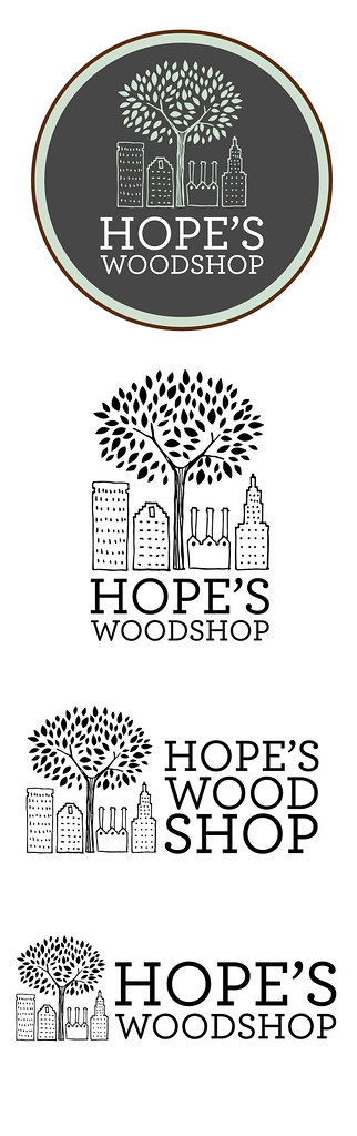
Hope's Woodshop is a non-profit based in Rhode Island that is dedicated to giving handmade furniture to local families in need. When they asked me to create a logo combining a tree and the Providence skyline, I happily agreed and set pen to paper. I love drawing this little city!
The woodshop makes beautifully crafted and simple furniture, the kind you can imagine passing down for generations. I used a simple hand drawn line style for the logo to emphasize this; it's no-frills but with a friendly charm that comes from the slight imperfections of drawing by hand.
I also created an illustration in the same style that shows off the design and features of their first table.
I'm excited about what this organization is doing, and am wishing them all the best! Be sure to take a look and their website and facebook.
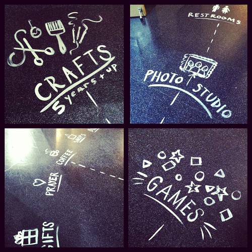
For signage at our most recent event at REN, I decided to try something new and paint on the floor. First of all, painting on the floor is really fun and I highly recommend it (as long as you test in an inconspicuous area first!). I used a mixture of about 50% acrylic paint, 50% liquid dish soap to make it easier to wash off. The thinner consistency also made it easier to paint with - a nice bonus.
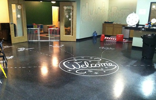
After lettering the large circle (approx. 5ft diameter), I painted arrows, illustrations, and lettering that explained what each area was. Below is a photo of the whole lobby area (this was mid-setup, so don't mind the random things scattered around!).
There were a lot of people walking around that night, so by the end of the event the paint was looking a little worn. It was all still legible, though, and I actually like the worn-in look.
If you're interested in seeing what the rest of the event looked like, you can watch a short video here.
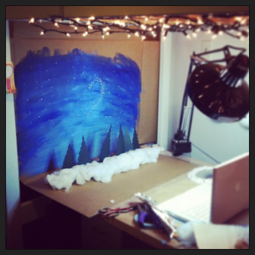
A week or so ago, I set about creating something special for PeaceLove to share with their online community as a holiday greeting. I've long been an admirer of stop motion animation, but had never really tried it myself. Thanks to some great friends at risd who let me tag along with them to the animation studios, I have a basic understanding of how it works. After sketching up some quick thumbnails to figure out how I wanted everything to look, I grabbed some paper, paint, and cotton and got to work.
I started out with a test run to make sure everything would work the way I wanted it to. I used a program called FrameByFrame that helped a lot with figuring out movement; it lets you see the previous frame overlayed with the current frame. This makes it really easy to see how much you're moving or changing each object with each frame. Thankfully everything worked the way it was supposed to, but the drawback was that FrameByFrame uses my built in camera so the image quality left a lot to be desired. Still, it was good practice and helped me plan the final version. (You can watch my test-run here)
For take two, I graduated to my DSLR camera for better image quality. I basically had to guess how much to move everything for each shot, but I had the basic idea of what I needed to do from my test animation. I also used the self-timer feature since I was working in low light; otherwise I might have accidentally moved the camera and made the photo blurry. Speaking of lighting, my "built-in" Christmas lights helped give some softer light, in addition to my nice bright worklamp. (You can see more of my lighting and studio setup in my studio tour.)
As you can see from this revealing behind-the-scenes shot, I didn't use any fancy tools! You can probably tell from the video that the backdrop was made from cardboard. The trees were cut from paper and taped to nail polish bottles to keep them standing. I needed a little more height, and a box of aluminum foil was the perfect size. The banners were taped to paint brushes, which were jammed into containers filled with tissue paper to keep them upright. Hopefully this doesn't take away from the "magic" of the illusion for you, but I really wanted to show that you can do a lot with what you already have around the house. The trick is keeping it hidden in the animation!
Thanks for reading, and (belatedly) happy holidays!
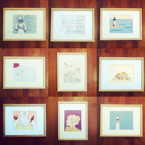
A quick note for the local folk - I have some framed prints left over from a gallery show that I'd rather not deal with shipping ;) so I'm offering them to Rhode Island people who would be able to pick them up. The prints are 8"x10" and the outer dimensions of the frames are approx. 13"x17". They're the ribba frames from ikea and cost me $10 so I'm selling the framed prints for $32 ea. Get in touch if you're interested- alli@allicoate.com
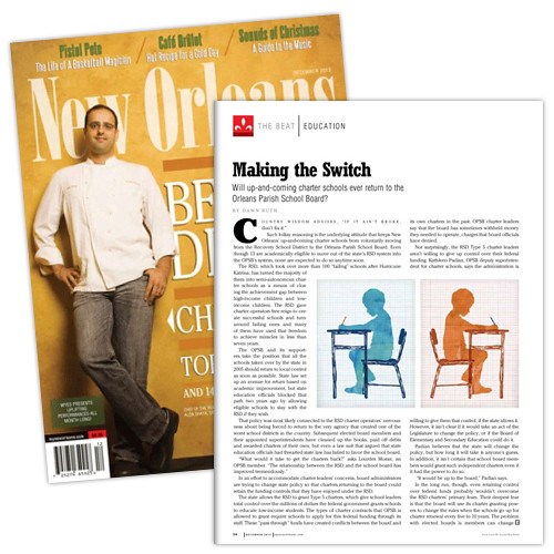
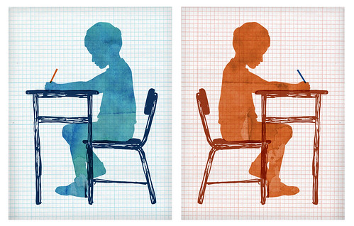
I had the opportunity to illustrate the education column for the December issue of New Orleans Magazine. After working with Art Director Eric Gernhauser a couple years ago on another illustration project, I was so excited to contribute to the magazine again. The article focuses on a switch in New Orleans' education system, so I used mirrored silhouettes and opposite color palettes to communicate this concept. I love how the grid paper and watercolor textures combine - click the image below to see a larger version if you'd like!
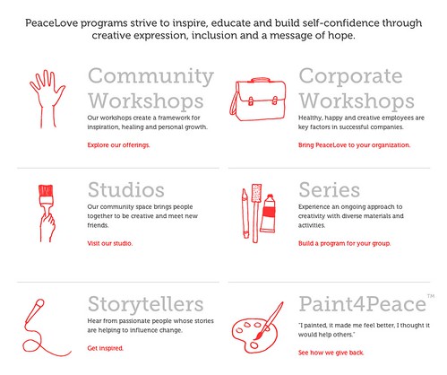
I'm so happy to announce that the new PeaceLoveStudios.com has been launched! This process has been a great collaboration between the team at PeaceLove, designers at Studio Pie, and developers at Trestian. To emphasize the artistic and community-building aspects of PeaceLove, I created an illustrated background filled with art supplies and a peaceful little world. I also created illustrations for the rollovers in the navigation bar, and icons scattered throughout the site. Take a look at the new website and let us know what you think!
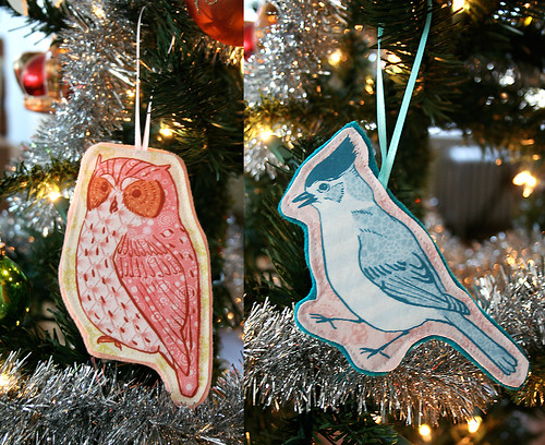
New in the shop are these illustrated bird ornaments- each ornament is stitched with care and backed in a coordinating felt. These look lovely on your tree and would also be great perched on a perfectly wrapped gift. Which would you prefer, the Owl or the Chickadee?
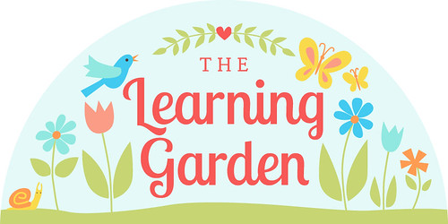
I designed this sign for a client who is opening a daycare that will focus on outdoor play in natural spaces. After playing around with a number of ideas, we decided to go with this version that focuses on typography with some playful illustrated elements scattered around. This design will be translated to a 12' wide x 6' high sign that will be mounted to the exterior of their new building.
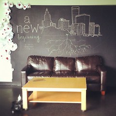
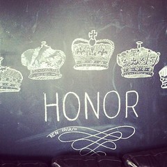
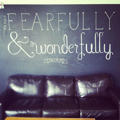
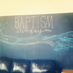
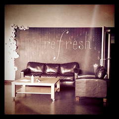
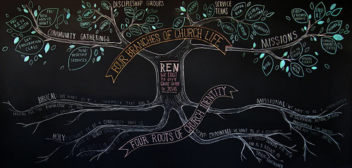
As a member of the art team at Renaissance Church, I've had the joy of working on lots of amazing projects. One of the longest running series (and also the most temporary) has been these chalkboard murals, which typically lasted only a week. Corresponding with whatever was going on that Sunday, the type and illustrations carried a simple message that would soon be wiped away to make room for a new one. Several of of these murals are collaborations - thank you to the friends who lent a hand.
(The latest mural, showing the core beliefs and structure of Ren, stretches all the way across the chalkboard wall.)