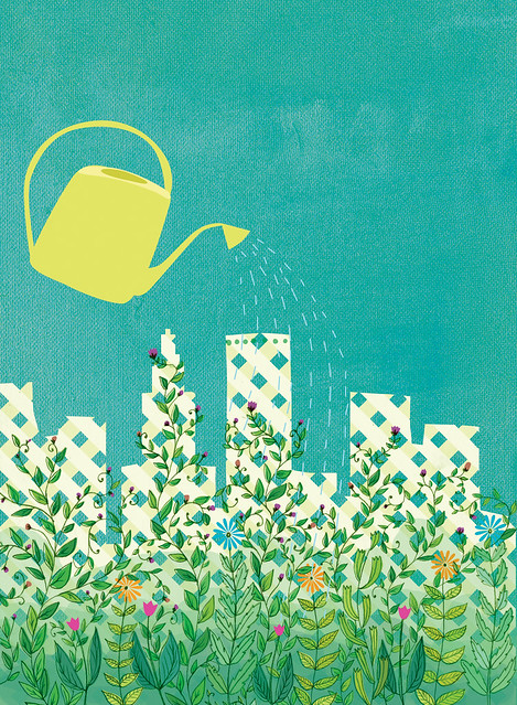
Growing a Greener City

Greener City cover illustration

Happy July! This is an illustration for the cover of the July issue of Providence Monthly. The idea was to combine the Providence skyline with a growing garden. I spent a lot of time drawing out the vines and leaves; it's great to get to illustrate for the cover because it is printed so large that details translate really well. Here's a slightly different version than was used:

...and a snapshot of the cover:

Greener City

Slow & Steady

Slow & Steady

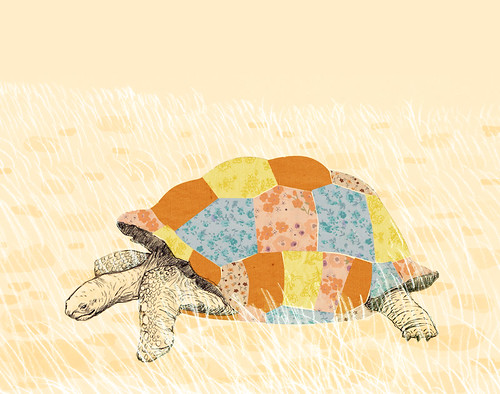
It's no secret, I have a definite obsession with patchwork. There are some images that instantly hit me as a perfect opportunity to show off some mixed-and-matched fabrics. This was one of them! I loved piecing together flowery fabric to make this tortoise's shell.

Want a Slow & Steady print for yourself? It's available in 5"x7" and 8"x10"!

Cloud Carrier

Cloud Carrier

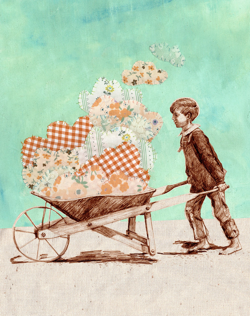
I have been spending a lot of time lately searching through old photographs, digging through my family's collections and diving even deeper into vast online archives. While I'm not sure exactly what has prompted this recent binge, it reminds me of the hours I spent as a child engrossed in the stories of how life used to be. Now, I'm enjoying taking these snapshots and giving them a new life.

For this piece I started with a pencil drawing of the boy carrying a wheelbarrow. After experimenting with a few colors digitally, I mixed a perfect shade of mint and painted a background directly onto some linen. Over the weekend I stitched some fabric clouds over the paint, and when everything was finished I combined all the separate elements digitally. I am so glad to live in a time when technology allows me to combine my favorite mediums this way!

I hope you like my newest experiment; I'd love to hear what you think! And if you have a spot on your wall just waiting for this fellow, you can find him in my store.
Alabama Studio Style

Alabama Studio Style book illustrations

I wanted to share with you a couple glimpses of this gorgeous book that I am so proud to be a part of. Alabama Studio Style combines fashion, craft, and cooking in such a beautiful and organic way; just flipping through the book feels like a vacation! This is the first book I've been published in, and it was such a thrill to see my name in print:

Alabama Studio Style book illustrations

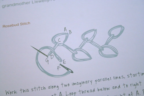
Being a crafter myself was incredibly helpful in figuring out how to communicate some of the more confusing stitches and techniques. It can be really challenging to get so much information in just one or two illustrations!

Alabama Studio Style book illustrations

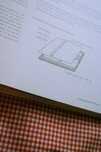
A little illustration describing the construction of a pillow cover:

Here's a cover page showing some snippets of projects using the illustrated techniques:

Alabama Studio Style book illustrations

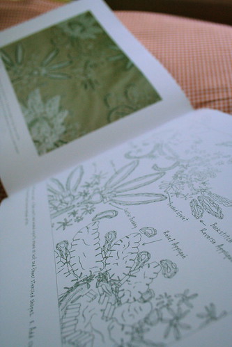
These full page "fabric maps" were the most time consuming, and in the end, most rewarding. Natalie has developed a beautiful technique of combining beading, applique, and embroidery to transform a single stenciled pattern into three distinct styles. For the illustration, Natalie asked for a detailed drawing that would correspond with a photo of each style, showing where each element is used.

This was such an amazing project and I am so honored and thankful to have had the opportunity to work with this talented team: Natalie Chanin, Robert Rausch, and Melanie Falick + co. at STC Craft!

winner!

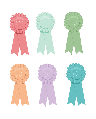
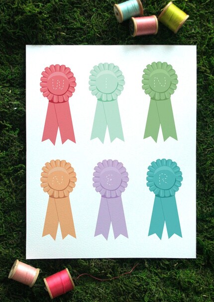
w-i-n-n-e-r

I love this candy-colored palette right now! So happy and summery. I thought this would make the perfect little gift for someone you think is a winner, so it's for sale here in my shop:

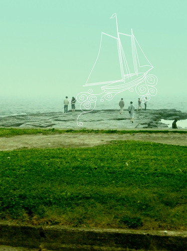
foggy drawing

newport fog

A quick shot out the window of the car this weekend, the fog was so thick you could hardly see the water. I pictured a ghostly ship, floating over the edge of the world. I tried at first to draw a ship from my head, but I realized I have no idea of how the structure of boats work! Hopefully it is convincing enough for an imaginary ship.

Hit the Road

Hit the Road

As promised, here's the full page map illustration! This will appear in Providence Monthly's June issue. Click for a closer look. Hope you have a great weekend!

Road trip peek

map detail

I have the worst sense of direction. I've lived in this city for almost six years and still manage to get myself lost. Probably for this same reason I have always had a fascination with maps... so it was great to get an assignment for a map-inspired road trip illustration! This is just a peek of it; I wanted to wait to share the whole illustration until I could show it with the cover lines. It was so much fun to draw tiny cars, sandcastles, bunnies, and I road that even I could navigate.