Monsters

nightmare

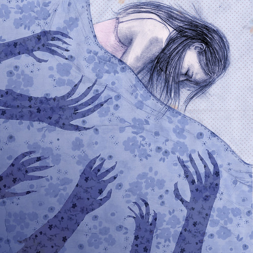
Finally, a new illustration! I was asked to create an image to accompany a poem about a childhood fear of monsters. Thinking back, I can still remember that instant surge of fear when I flicked off the basement light, sure that the darkness behind me was suddenly filled with hands trying to grab my legs as I ran up the stairs. I remember the relief of slamming the door on the dark unknown. That is the kind of "monster" that scared me, not an elaborately grotesque imagined beast but the feeling that there was an unseen "something" there, silently preparing to attack.

Whew! I hope that creeping, silent fear is communicated in the image. I'll post again once it's been published, but just wanted to let the world know that yes, I am still here, still drawing!

Soft

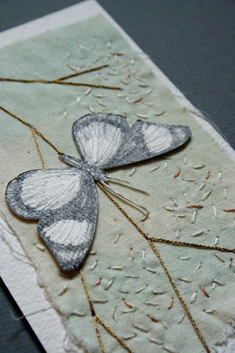
original collage- hints of spring (detail)

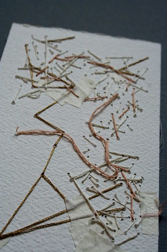
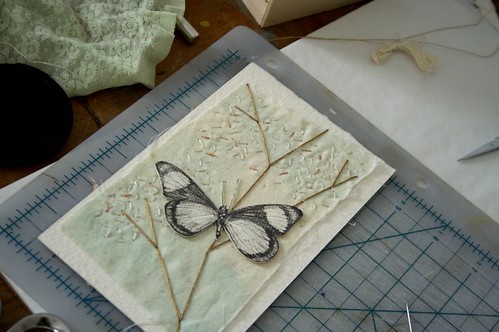
After months of only creating works digitally, I've been longing to make something that lives beyond my computer screen. This collage combines a drawing inspired by a taxidermy butterfly with some of my favorite threads and a scrap of fabric left over from my projects in Bolivia. I love the faded colors (which might not translate so well on screen, unfortunately) and the beautiful mess that always occurs on the back of an embroidery.

original collage- hints of spring (back)
hints of spring, in progress

Coffee culture

Coffee illustrations

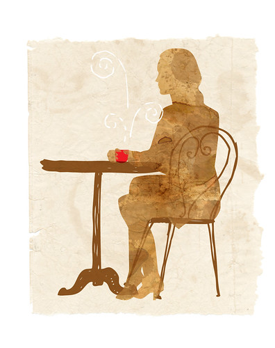
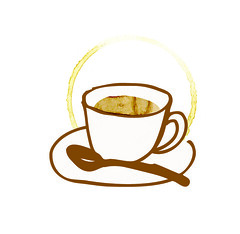
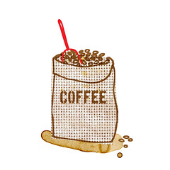
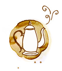
I absolutely love starting my day with a cup of coffee. The comforting warmth, a kiss of steam, deep chocolate-y brown... even the splotches and drips I used to make these illustrations are comforting to me. This set of coffee-fueled illustrations was published in the Bay Magazine's February issue. Enjoy!

Coffee illustrations

Gliding into Winter

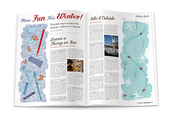
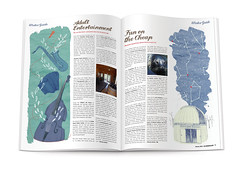
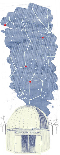
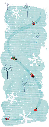
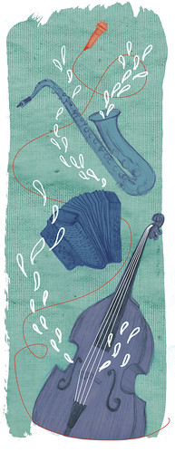
Winter is here! How fitting that on this first day of the new season we have gotten our first real snow here in Providence, and that I have these illustrations to share with you. SO Rhode Island asked me to create  4 half-page illustrations for a winter story. I am seriously filling up my portfolio with the color blue; it is my favorite, especially in minty hues.

SO winterguide spread 1
SO winterguide spread 2
Winter Guide- observatory
Winter Guide- snow tubing
Winter Guide- live music
Winter Guide- art classes

Oh Comely magazine

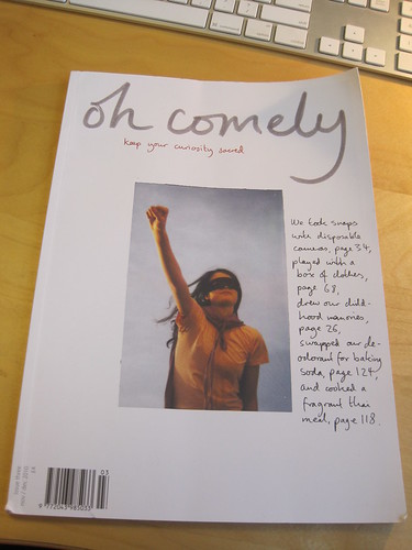
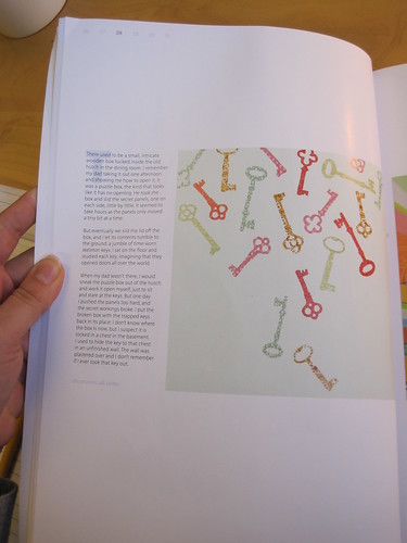
oh comely magazine feature Have you heard of this new magazine, Oh Comely? I love their concept; it's about people and their quirks and their creativity, rather than money and what it can buy. I spent an evening reading through this issue and very much enjoyed it. Oh, and I have a little page in it! I was asked to create an illustration about a childhood memory of discovery.
oh comely magazine feature

oh comely magazine illustration

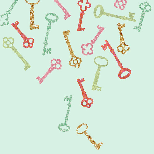
There used to be a small, intricately inlaid wooden box tucked inside the old hutch in the dining room. I remember my dad taking it out one afternoon, and showing me how to open it. It was a puzzle box, the kind that looks like it has no opening. He would take the box and slide these secret panels, one on each side, little by little. It seemed to take hours since the panels only moved a tiny bit at a time. But eventually we slid the lid off the box, and I let its contents tumble to the ground – a jumble of time-worn skeleton keys. I sat on the floor and studied each key, searching for clues, imagining that they opened doors all over the world. Later, when my dad wasn’t there to open the box for me, I would sneak the puzzle box out of the hutch and work it open myself, just to sit and stare at the keys. But I pushed the panels too hard, and the secret inner workings broke. I put the broken box with the trapped keys back in its place, and was eventually found out. I don’t know where the box is now, but I suspect it is locked in a chest in the basement. I used to hide the key to that chest in an unfinished wall, but the wall was plastered over and I don’t remember if I ever took that key out in time.
Banking on Better Times

New Orleans Magazine illustration

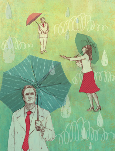
Last month I created this illustration for New Orleans Magazine, and I wanted to share a bit of my process. The article was an overview of the state of the economy, and I drew a few major themes from it- uncertainty, hope, and tentativeness.

sketches

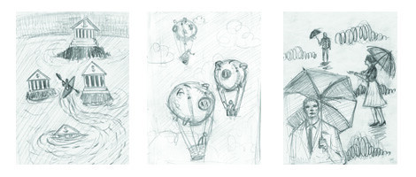
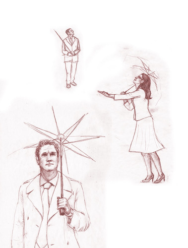
My sketches show banks (some doing better than others), piggy bank hot air balloons going wherever the breeze takes them, and businesspeople peeking out from other their umbrellas hoping for the sun to come out. My favorite was the last one, so I was delighted to hear that the client wanted to go with it.

Fabric background detail

I started with a background wash on a subtly printed fabric. My color scheme was dusty blue and green with accents of orange and red, and for this painted layer I worked deeper colors towards the bottom with lighter colors at the top.

people drawing

I layered a pencil drawing of the characters with other pieces of fabric and more drawings here and there. I love the freedom I have with Photoshop to take my hand-made elements and tweak them all to 'work' together. I hope you like my little sneak peek- take a look at the digital issue of New Orleans Magazine to read the full article.

New Orleans Magazine spread

Wedding Wine Labels

Wedding Wine Labels

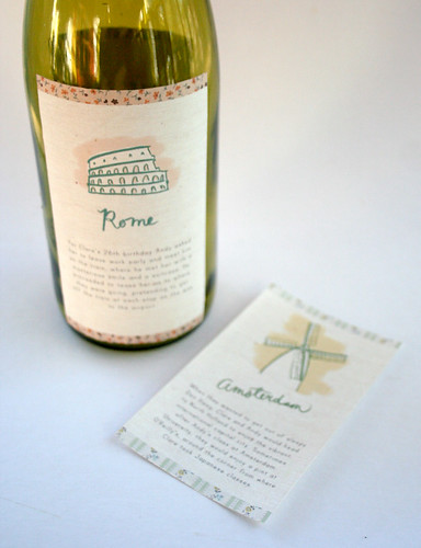
A couple months ago I was approached to create a set of custom illustrated wine labels for a world-traveling couple's wedding reception. One of the aspects of illustration that I absolutely love is being challenged will all sorts of different projects; experimenting with new materials and formats is so exciting and rewarding!

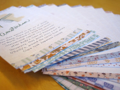
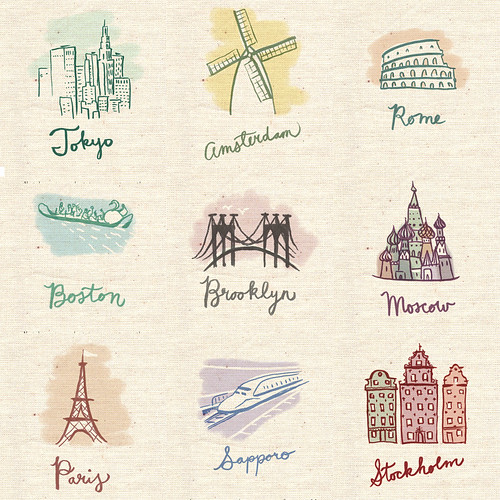
The client was looking for wine labels based on each city they had traveled to as a couple to use as table markers for their reception. They were really a dream to work with, and the process moved smoothly along from mockup to final designs. I created a simple but elegant drawing for each label, then pulled from my fabric collection to reference designs and colors reminiscent of each city.

Wedding Wine Labels
Wedding Wine Labels

I think these add a great heartfelt touch to a celebration, and I am so glad that I had the chance to work on this project.

If I Was You...

If I Was You...

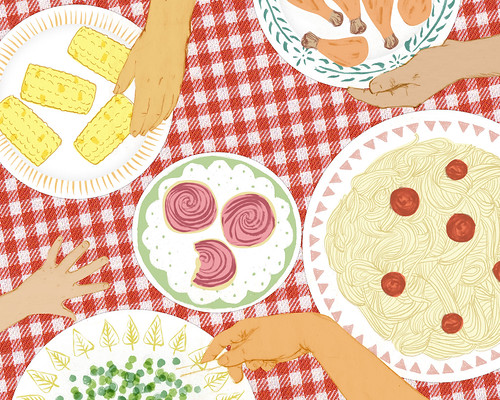
I recently participated in a collaborative illustration project called "If I Was You." Each week, an illustrator creates an image based on the artist from the previous week, answering the prompt, "If I was you, I would...".  Hannah Warren was my inspiration, and it was great to dig through her work! I read that her favorite things are "Family, friends, my boyfriend and all you can eat buffet." So here it is, Hannah! If I was you, I would invite all my family and friends over for a homemade all you can eat buffet.

See the rest of the entries to the If I Was You Project, and check back in a couple days to see what another illustrator would do if they were me!