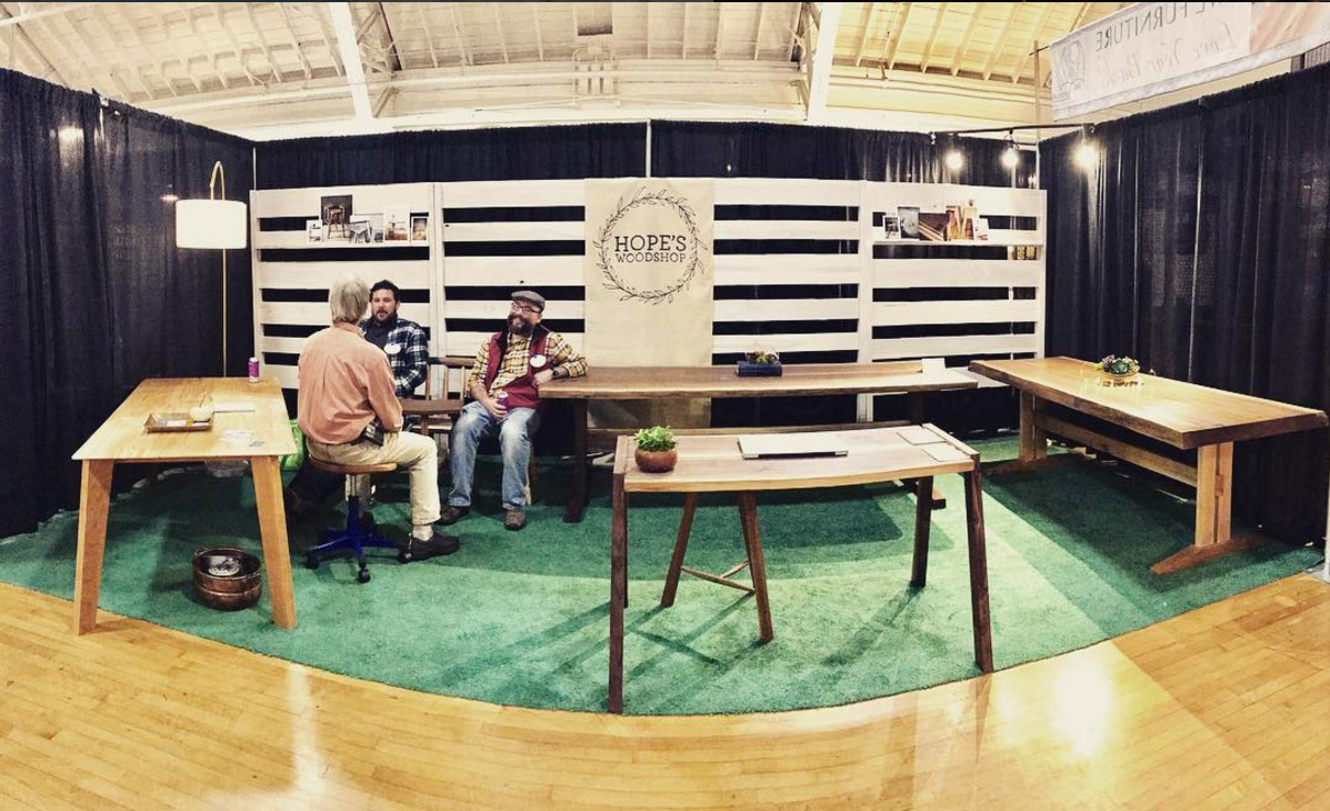
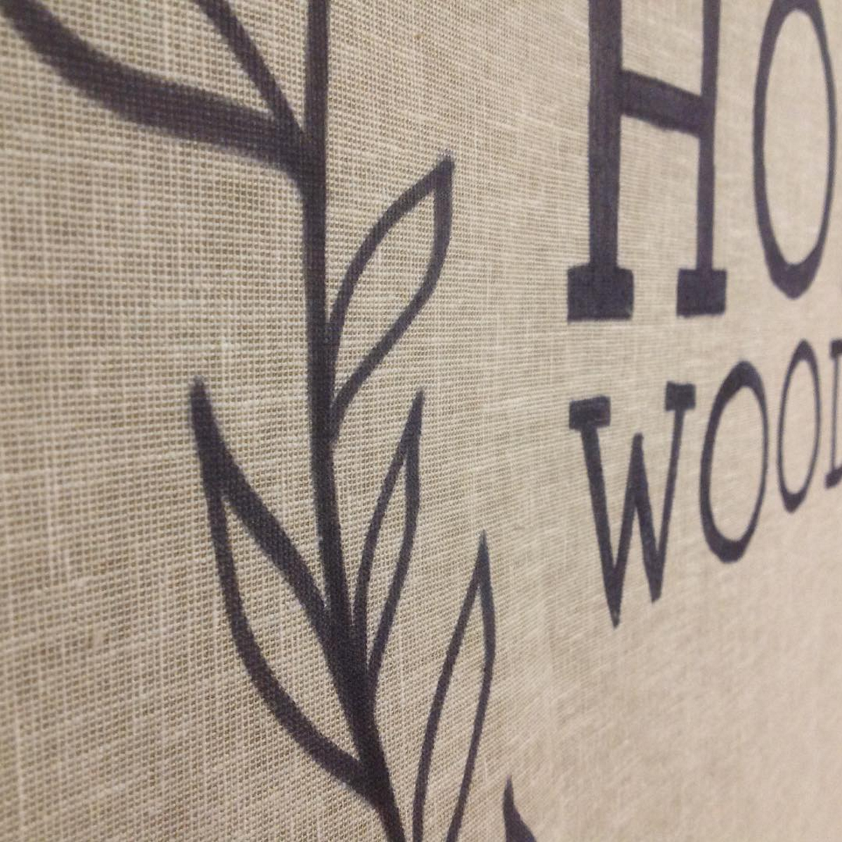
Hope's Woodshop asked me to create a fabric banner for the recent Fine Furnishings Show - I found a rough linen weave that contrasted nicely with their white wood backdrop and added an alternate version of their logo onto the center of the banner. It's been fun to see this company grow since I first created their logo years ago, and I'm excited to see how things develop for them next!
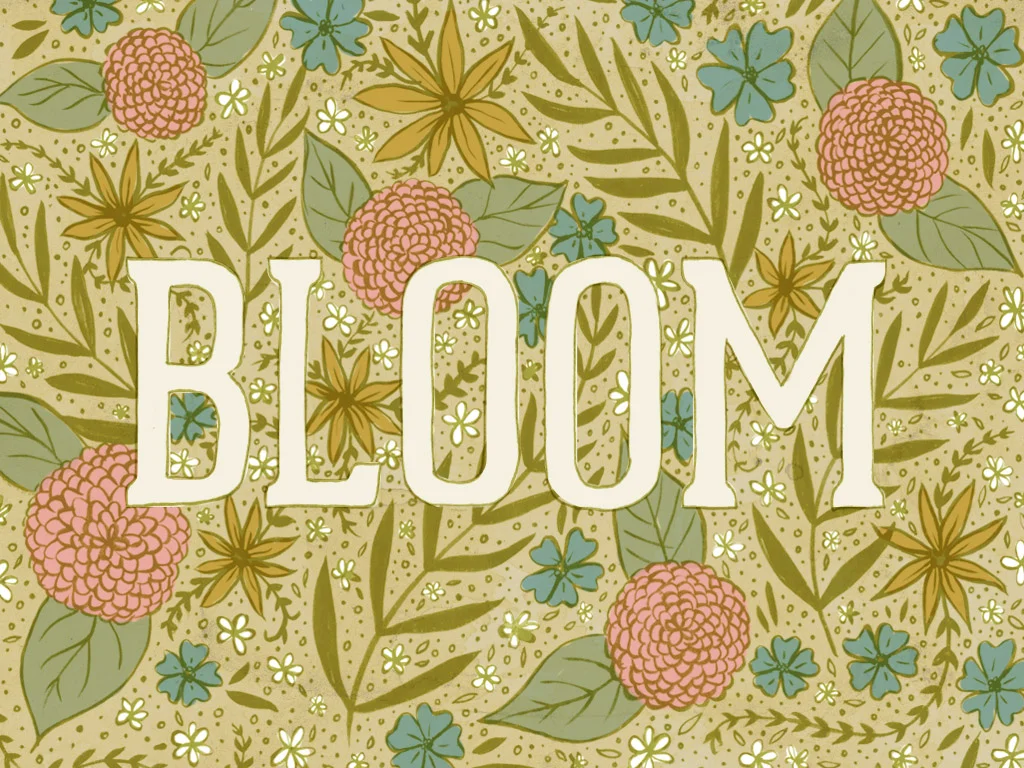
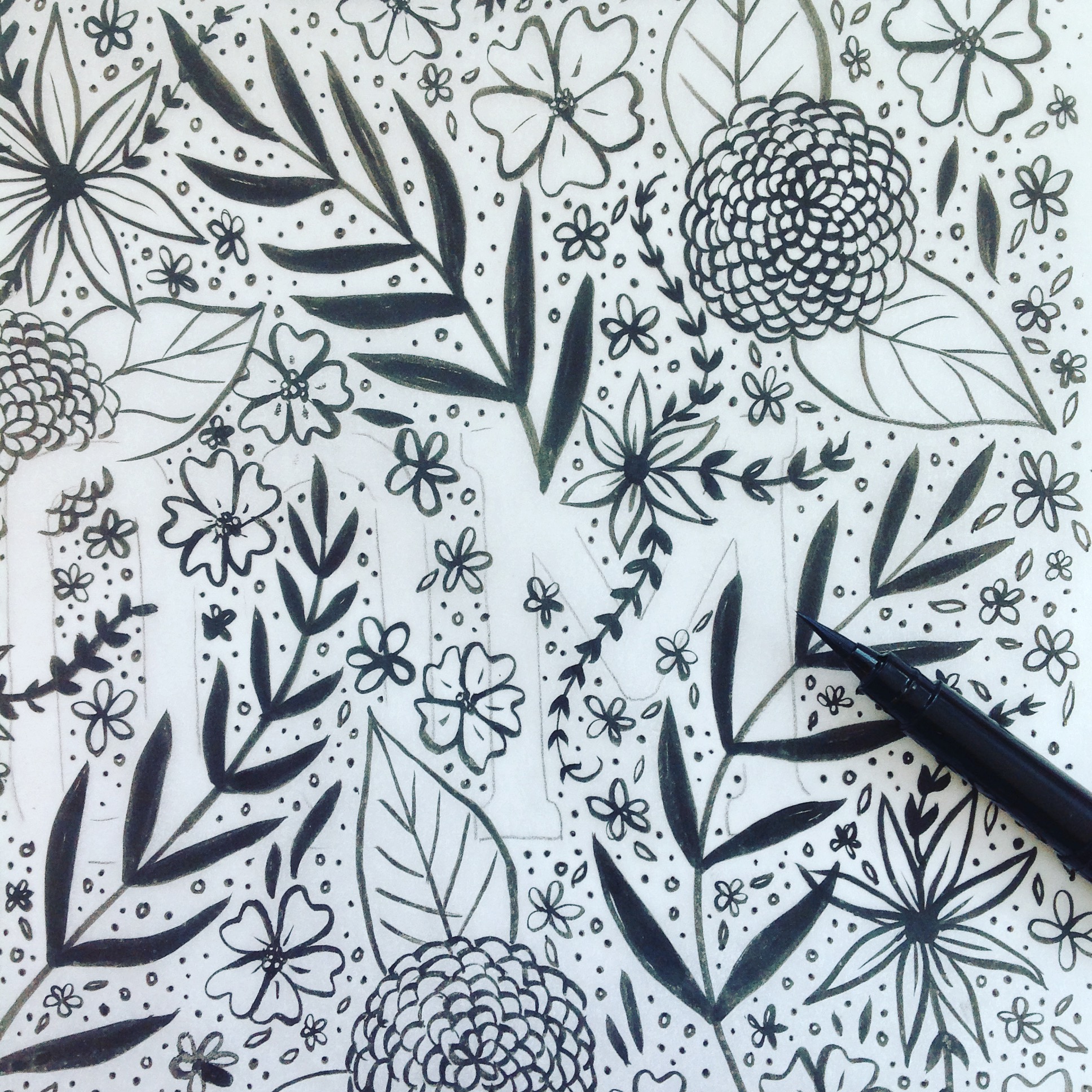
Bloom
This week I finished up this piece for REN - they ended up going with a different colorway but this was my favorite. Hope you enjoy!
"Within Her" prints in the shop!
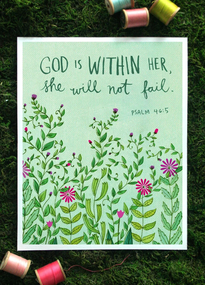
Here's another new print that just landed in the Shop: "Within Her" available in 5x7 and 8x10
This print features hand-lettering of Psalm 46:5 ("God is within her, she will not fail.") and simple floral illustrations. The mint green background with a subtle texture is anchored by a flourish of colorful leaves and flowers. This print looks stunning in a white frame with a white mat, especially against a wall painted in a coordinating color.
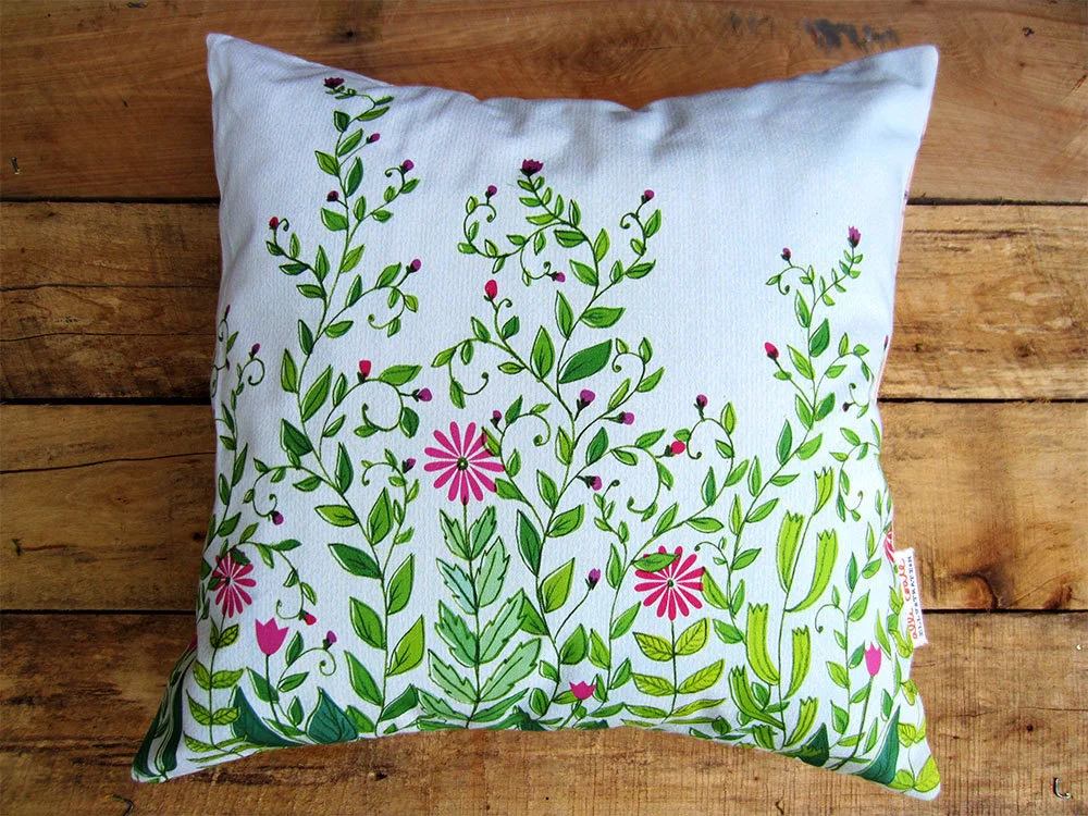
p.s. This design is also available as a pillow cover!
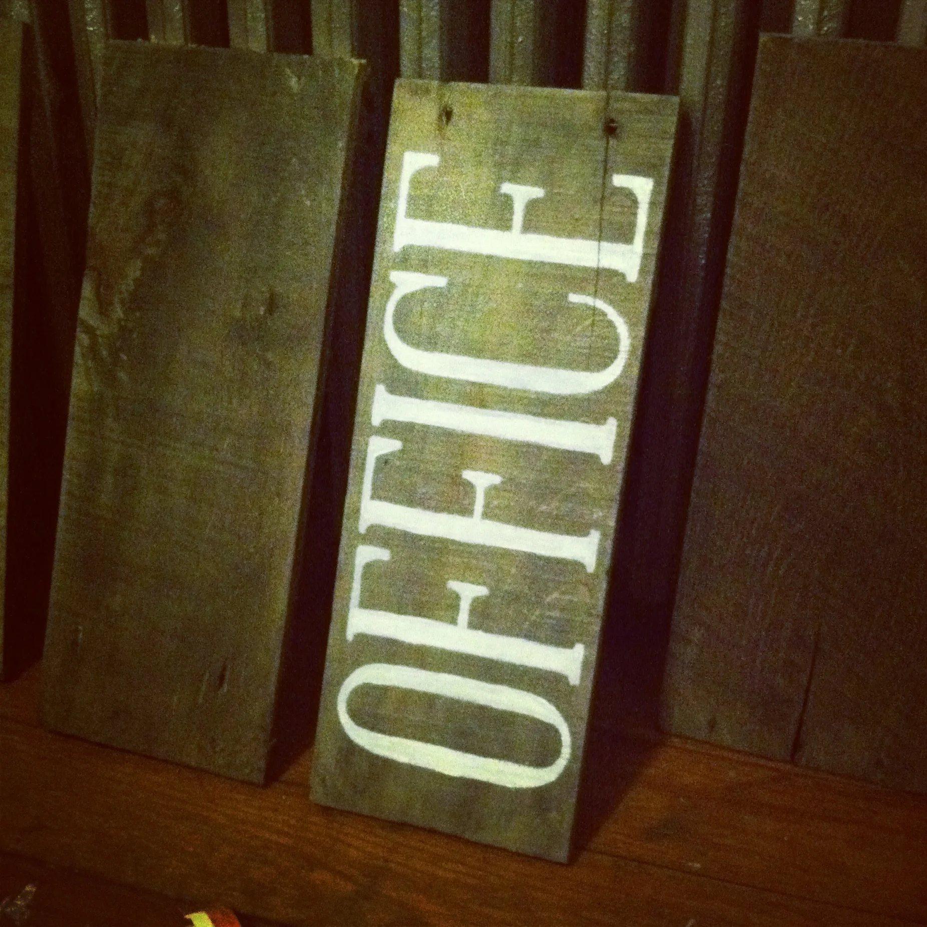
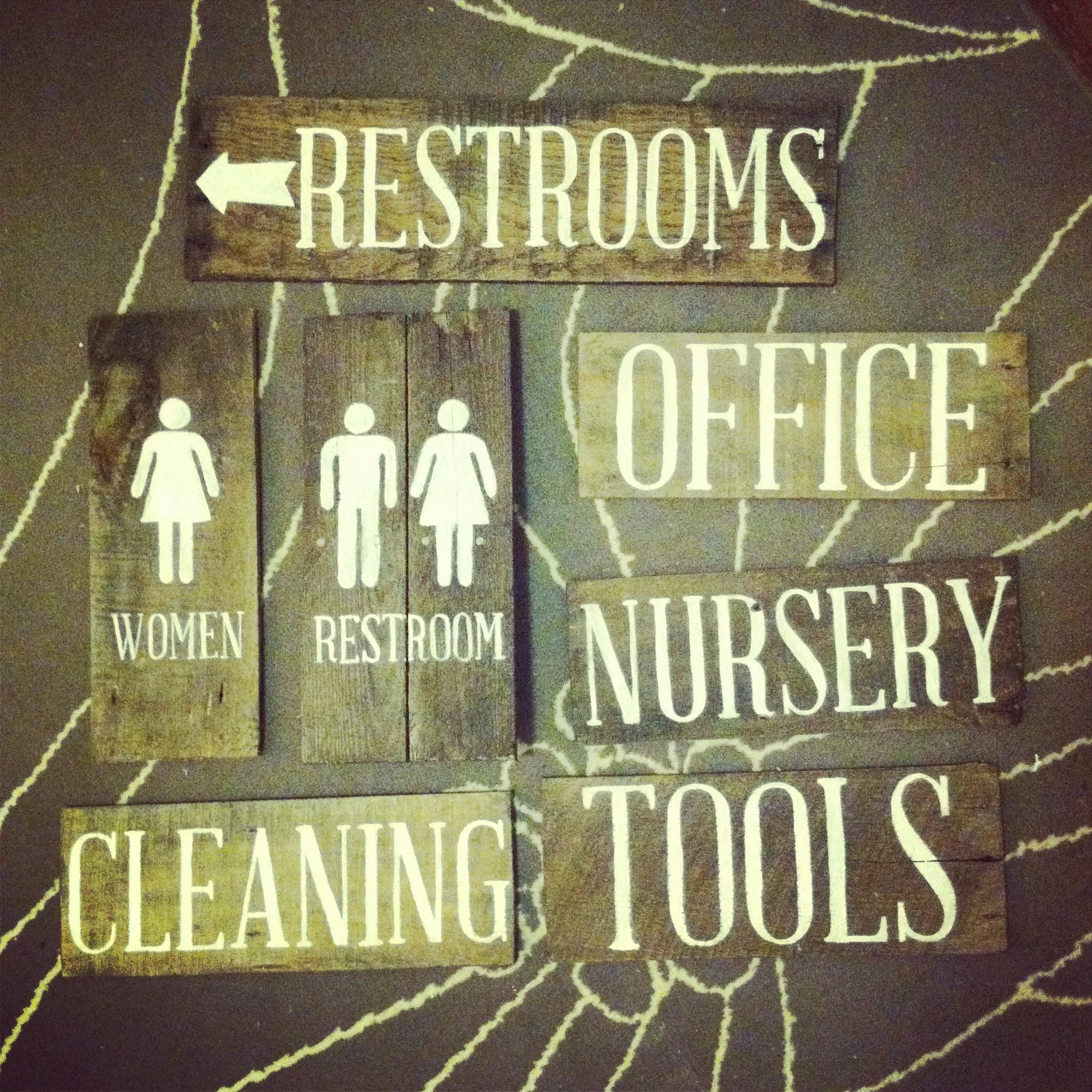
Painted Wooden Signs
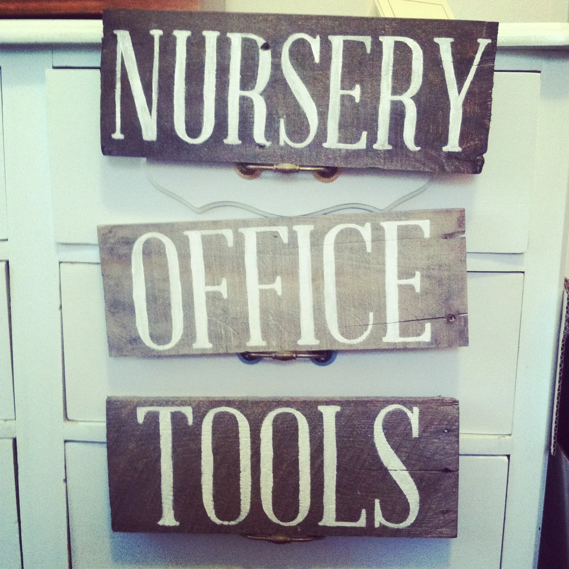
These hand-painted signs were created for Renaissance and are pretty simple to do yourself with only a few materials.
MATERIALS:
- wood, cut to size
- black wood stain (optional)
- print-outs of lettering or design
- white chalk
- paintbrush
- acrylic paint
Here's what I did:
- Since the wood pieces I used were from different sources and had slightly different colorings, I used a black wood stain to make all the pieces unified.
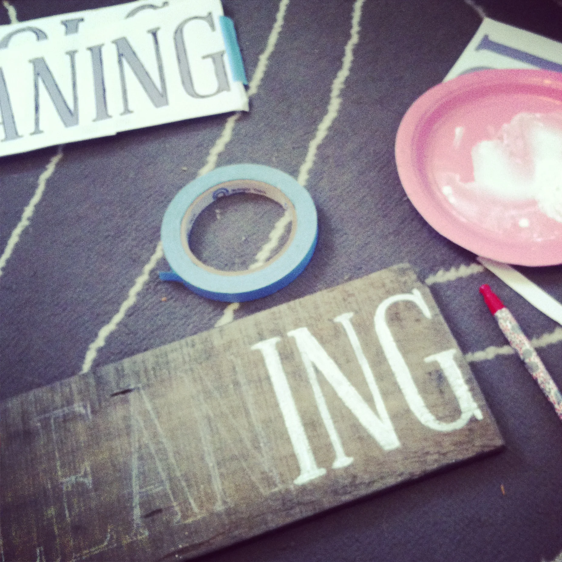
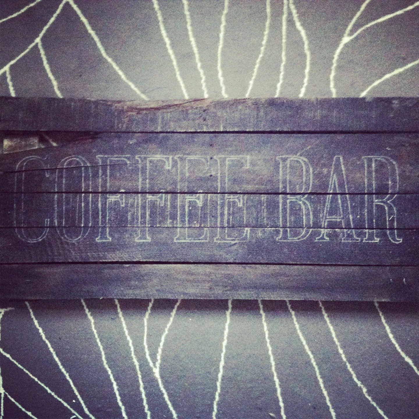
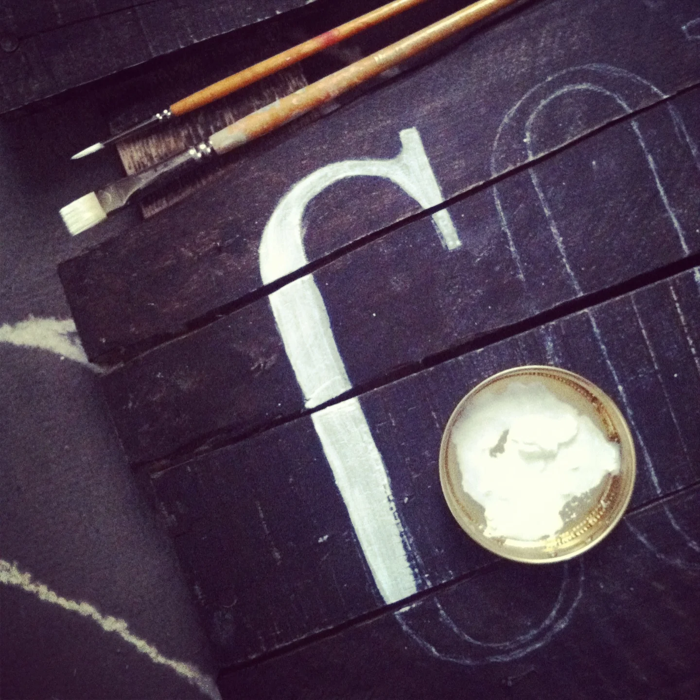
- I printed out the lettering to transfer to the wood by covering the back of the paper with white chalk. Then, I traced the paper printout letters with a ballpoint pen, pressing hard. This left a light chalk outline to help make the painting faster and easier.
- After the design was transferred, it was just a matter of painting all the letters in. I used a couple sizes of brushes and watered down my acrylic paint a tiny bit to help it flow better.
I love how these came out and would definitely recommend trying a similar project out yourself.
There Is Always Hope
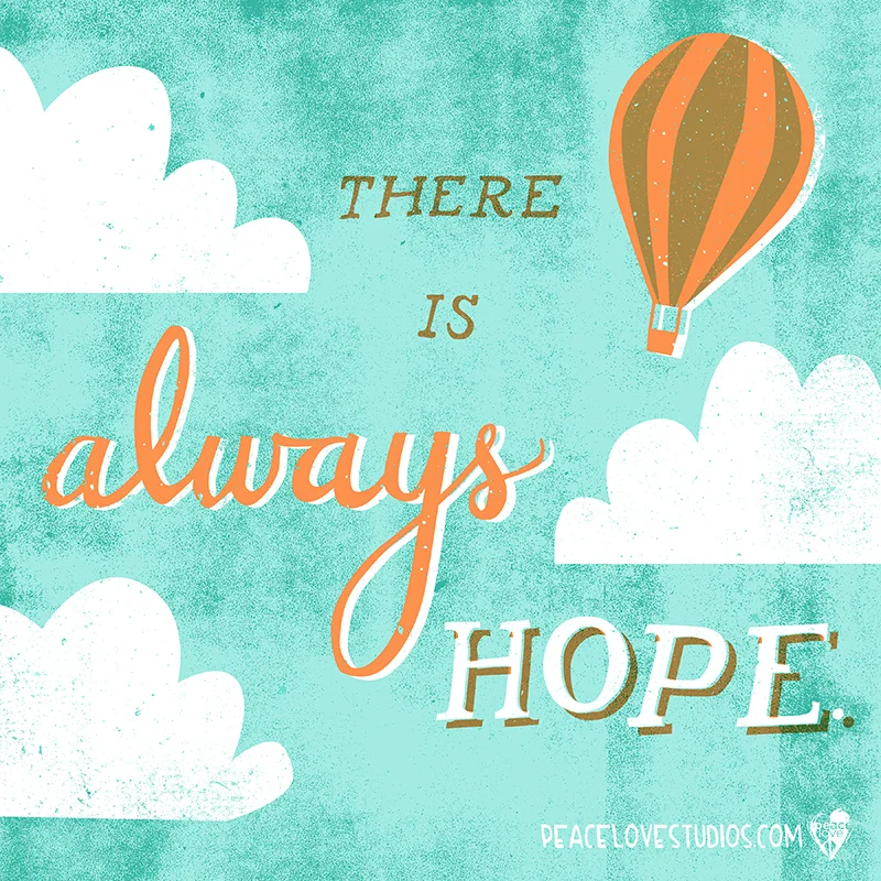
Remember that "there is always hope." Hand lettering and illustration for PeaceLove Studios, posted on their blog today. You can download this artwork as a free background wallpaper for your computer or phone from the PeaceLove blog.
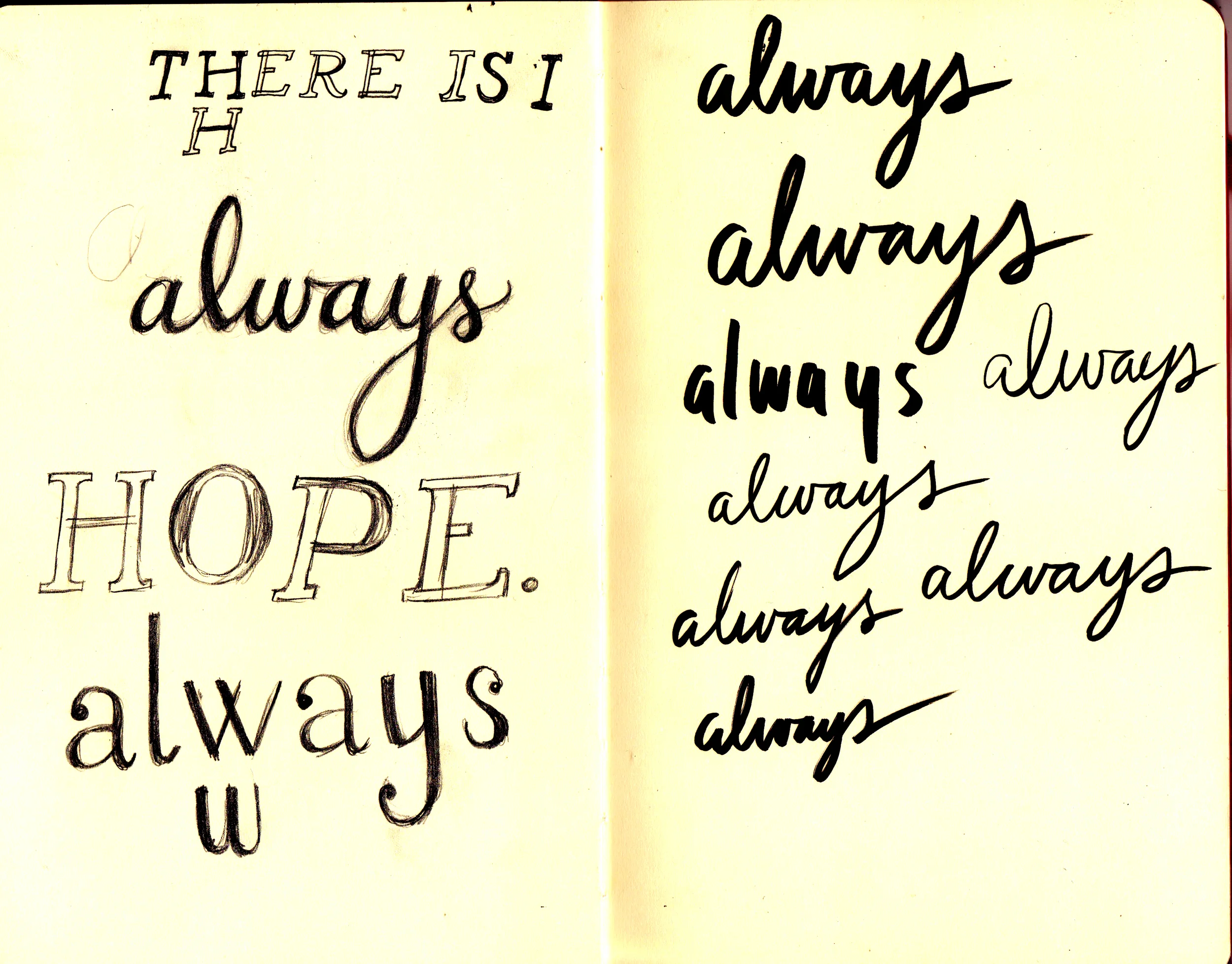
Lettering work in my sketchbook
Painting on the floor
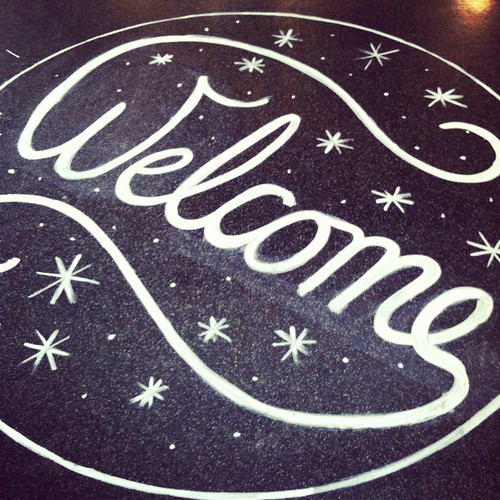
For signage at our most recent event at REN, I decided to try something new and paint on the floor. First of all, painting on the floor is really fun and I highly recommend it (as long as you test in an inconspicuous area first!). I used a mixture of about 50% acrylic paint, 50% liquid dish soap to make it easier to wash off. The thinner consistency also made it easier to paint with - a nice bonus.
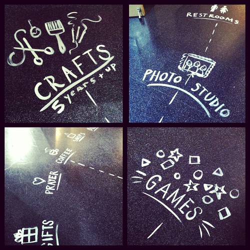
After lettering the large circle (approx. 5ft diameter), I painted arrows, illustrations, and lettering that explained what each area was. Below is a photo of the whole lobby area (this was mid-setup, so don't mind the random things scattered around!).
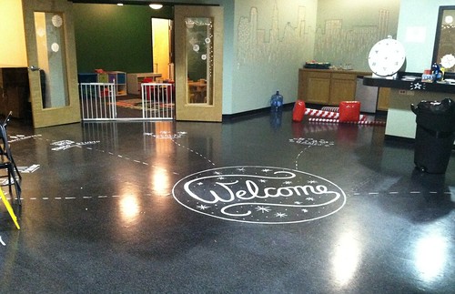
There were a lot of people walking around that night, so by the end of the event the paint was looking a little worn. It was all still legible, though, and I actually like the worn-in look.
If you're interested in seeing what the rest of the event looked like, you can watch a short video here.
Playing with stop-motion
A week or so ago, I set about creating something special for PeaceLove to share with their online community as a holiday greeting. I've long been an admirer of stop motion animation, but had never really tried it myself. Thanks to some great friends at risd who let me tag along with them to the animation studios, I have a basic understanding of how it works. After sketching up some quick thumbnails to figure out how I wanted everything to look, I grabbed some paper, paint, and cotton and got to work.
I started out with a test run to make sure everything would work the way I wanted it to. I used a program called FrameByFrame that helped a lot with figuring out movement; it lets you see the previous frame overlayed with the current frame. This makes it really easy to see how much you're moving or changing each object with each frame. Thankfully everything worked the way it was supposed to, but the drawback was that FrameByFrame uses my built in camera so the image quality left a lot to be desired. Still, it was good practice and helped me plan the final version. (You can watch my test-run here)
For take two, I graduated to my DSLR camera for better image quality. I basically had to guess how much to move everything for each shot, but I had the basic idea of what I needed to do from my test animation. I also used the self-timer feature since I was working in low light; otherwise I might have accidentally moved the camera and made the photo blurry. Speaking of lighting, my "built-in" Christmas lights helped give some softer light, in addition to my nice bright worklamp. (You can see more of my lighting and studio setup in my studio tour.)
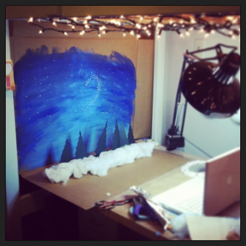
As you can see from this revealing behind-the-scenes shot, I didn't use any fancy tools! You can probably tell from the video that the backdrop was made from cardboard. The trees were cut from paper and taped to nail polish bottles to keep them standing. I needed a little more height, and a box of aluminum foil was the perfect size. The banners were taped to paint brushes, which were jammed into containers filled with tissue paper to keep them upright. Hopefully this doesn't take away from the "magic" of the illusion for you, but I really wanted to show that you can do a lot with what you already have around the house. The trick is keeping it hidden in the animation!
Thanks for reading, and (belatedly) happy holidays!
Typographic Chalkboard Murals
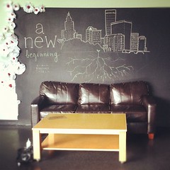
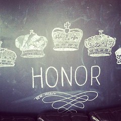
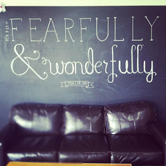
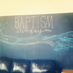
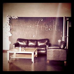

As a member of the art team at Renaissance Church, I've had the joy of working on lots of amazing projects. One of the longest running series (and also the most temporary) has been these chalkboard murals, which typically lasted only a week. Corresponding with whatever was going on that Sunday, the type and illustrations carried a simple message that would soon be wiped away to make room for a new one. Several of of these murals are collaborations - thank you to the friends who lent a hand.
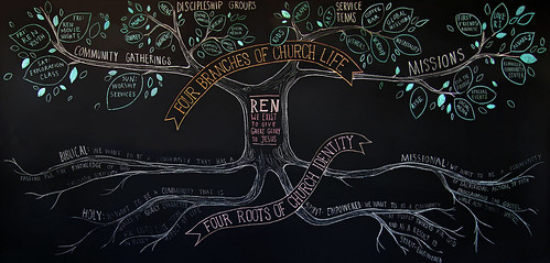
(The latest mural, showing the core beliefs and structure of Ren, stretches all the way across the chalkboard wall.)
Summer Bucket List

Here's a quick full page illustration I did for the cover story of SO Rhode Island's June issue. I haven't had a chance to do very much hand-lettering lately, so I jumped at the opportunity. You can read the article for our Rhode Island-y summer guide.
Vintage farm wedding
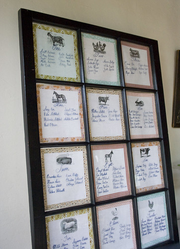
This summer I had the pleasure of working with a dear friend on some projects for her wedding reception. I used vintage illustrations, hand-lettering, and a palette of antique-hued fabrics to create table numbers, signs, and a hand-made photobooth. Take a look!
For the seating chart, we used a 12 paned window frame that belonged to the bride - how perfect that the guests fit at 12 tables! Paper backings were attached to the back side of each pane, and the bride wrote on the front of each pane with a glass marker.
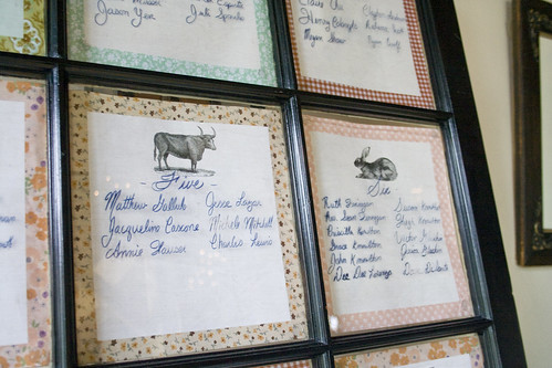
I designed the paper backings with a vintage farm animal illustrations to identify each table, and borders of my favorite vintage-inspired fabric patterns.
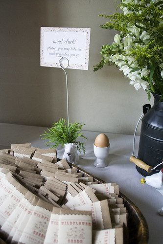
This sign invited guests to bring one of the cow creamers or egg cups that decorated the reception home with them. Another friend of the bride created sweetly packaged wildflower seed favors.
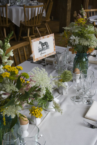
Each table was marked with a card featuring a vintage farm animal illustration and a patterned border that corresponded with the table seating chart. The flower arrangements were created by the bride's mother- aren't they beautiful?
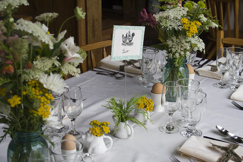
White ceramic cow creamers worked perfectly to display the table cards and hold tiny wildflower blossoms. Brown eggs in little egg cups also dotted the tables - the bride and groom are both chefs so baking and cooking details were used throughout the reception.
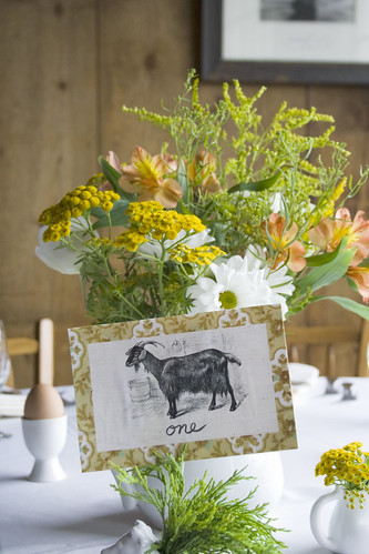
I can't get over how lovely these flower arrangements were! The colors tied in perfectly.
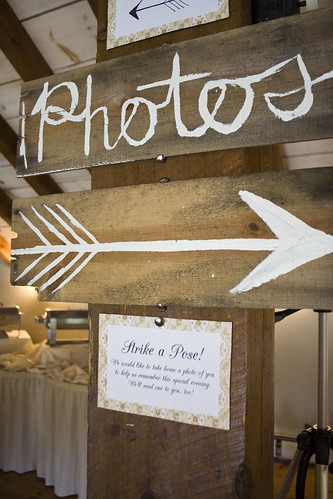
More hand painted signs and printed cards helped guests find their way around the multi-leveled barn that housed the reception. The wooden pieces for these signs were salvaged from old crates and boxes.
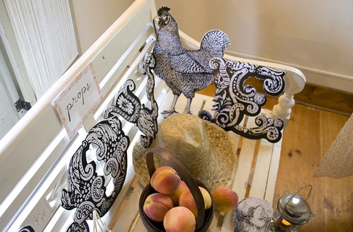
Do you recognize this chicken? Some of the animals from the table cards made their way into our hand-made photobooth. Large printouts of chickens, rabbits, and "L-O-V-E" letters were mounted on sturdy foamcore. Other props included old-fashioned lanterns, a wooden wheelbarrow, hats, and baskets of peaches. The backdrop was made with one of the fabrics that was used on the table number borders.
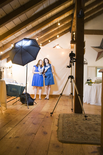
Two guests gave the photobooth a try - hooray, it works!
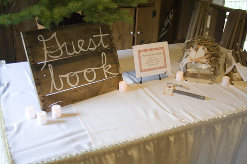
The groom had this great idea for an unconventional guest book; guests were invited to write on a tag and hang it on a tiny Christmas tree from the couple's home. By the end of the night the tree was filled with well-wishes and love from their friends and family.
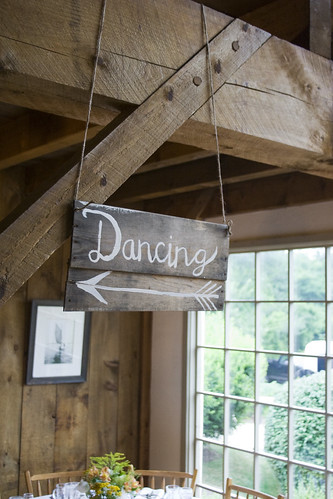
This sign pointed up the stairs from the lower level of the barn, where dinner was served, to the dance floor on the upper level.
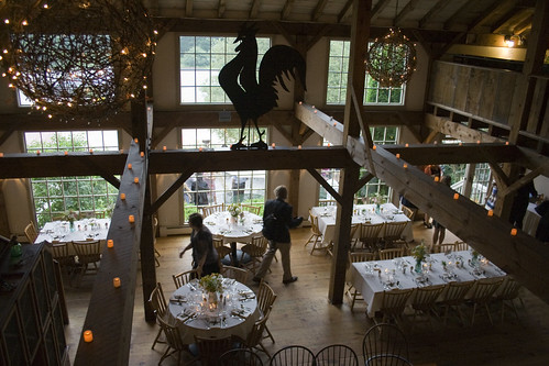
Here's an overview of the space from the loft area. The entire reception was lovingly decorated by friends and family of the couple. It was a beautiful celebration of a beautiful couple. Congrats!

