
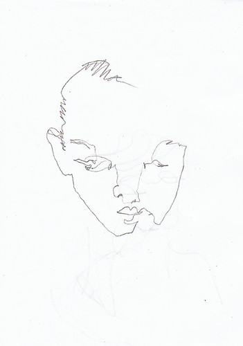
Empty Feeling
I'm super-busy, but I still wanted to drop a post here to share a couple exciting news-es:
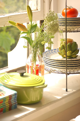
I got my first try at styling for a real-life photo shoot last month! Christine had her house featured on Design*Sponge, and I was lucky enough to get to contribute to the project. It was truly so much fun to play and experiment with these little vignettes. More photos here.
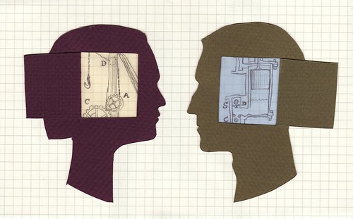
This illustration accompanies an article about the physiological differences between men and women. The drawings inside the profiles are from diagrams of two different machines, implying that despite the similarities, the elements that compose the brain and body are assembled and function differently.
I love the ability cut paper has to communicate an idea simply and quickly! It requires a paring down to only the essential elements.
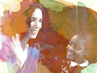
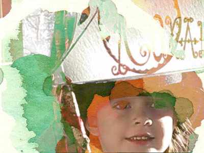
I'm very excited to be working on a project for a talented woman named Sarah Salerno Thomas. More info to come, but for now I'd like to just share a few of the images I've been working on. Sarah does interactive performances with children in schools, museums, and libraries across the Northeast. The photos she has collected from her different performances vary slightly in lighting conditions, exposures, and image quality. This is fairly standard issue, and it can be a challenge to find a way to unify an array of images.
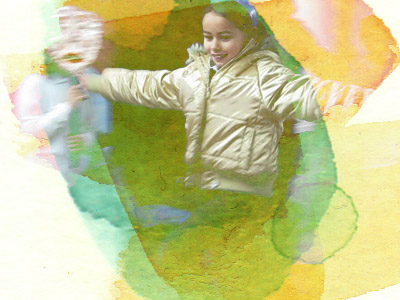
For Sarah's project, I've chosen to overlay the images with colored drops of paint. It creates a playful, exciting result. I love this technique and hope to be able to use it often- it's a very satisfying way to incorporate your hand into digital work.
logo design by Lawrence A. Hall

Some of the most memorable experiences of my time at RISD were the collaborative projects that I was fortunate enough to be involved in. I worked with a group of students to run a benefit for 2006's World AIDS Day at RISD. My main portion was to create an interactive art installation for the event. The main goal of the installation project was to communicate the scale of the world epidemic, but without making the viewer feel completely helpless.
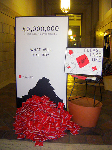
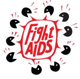
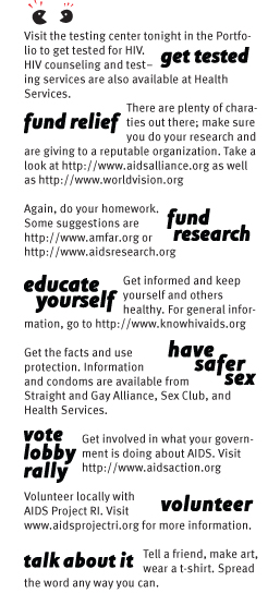
The structural aspect of the installation was a large freestanding panel that was attention-grabbing without being overwhelming. It presented the information simply: "40,000,000 people infected with HIV/AIDS. What will you do?" At the base of the panel was a pile of little pillows. Each pillow was printed with the "Fight Aids" logo on one side and a practical way to help fight HIV/AIDS on the other. The tips were: get tested, fund relief, fund research, educate yourself, have safer sex, vote-lobby-rally, volunteer, and talk about it. A handout accompanying the installation provided further details into each of these tips. A poster (looking silly propped up on a chair, but doing its job anyhow!) suggested ways to use the fabric pillows.
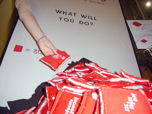
The pillows were arranged in a pile representing the problem that would diminish as each person took one of the tips away. I painted the shadow of the pile onto the panel behind it, so that as the pile grew smaller and smaller over the week there was a way to measure the progress against the original pile. The installation remained in the 15 West lobby for the week following the event, and served as a prompt and reminder for student housing occupants, staff, RISD library users, and Portfolio Cafe visitors.
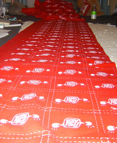
Yards and yards and yards of silkscreened fabric that could not have come into existence without the help of Chris Tolles and Will Reeves!
The task of assembling all the little pillows was undertaken by apparel students spearheaded by super-friend Andi Archer!
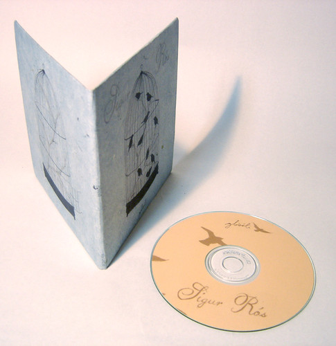
This morning I'm sharing a project from two years ago- a hypothetical package design of a Sigur Ros song called "Glosoli". I wanted to share this project quickly because, while I'm not completely satisfied with the interior of this design, I thought it would be worthwhile to show off the parts I do like.
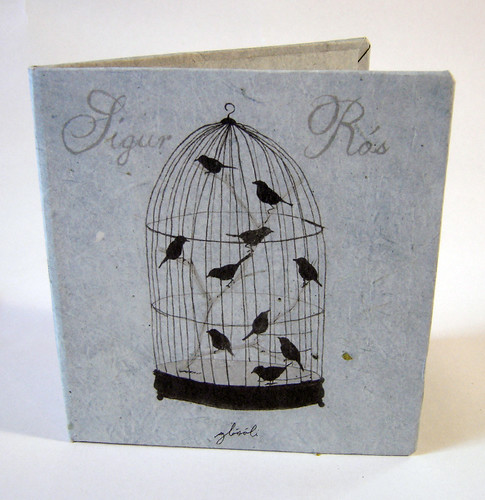
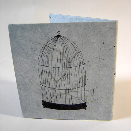
"Glosoli" in Icelandic means "glowing sun" . After listening to the song a dozen times on repeat, what I remember being really struck by was the building up of tension and then a great sense of release. I chose to express this visually with a birdcage. The front cover shows the birdcage filled with birds. The interior (not pictured) shows the cage door swung open and birds streaming out across the sun- the CD decked out in gentle orange. The back cover is the empty birdcage.

This is a recent project I've done for an Etsy shop called edafedd. "Edafedd" is a Welsh word for yarn or thread, which ties in perfectly to the shop's products- crochet animal patterns. The shop owner's favorite animal and part of the inspiration for the product line is a whale, so it was important to include the whale tail's motif in the design.


I decided to create the logo by drawing with thread, a treatment I experimented with in a portrait of Leslie Feist. The thread travels across the store graphic and takes on the form of the whale tale, an analogy for the process of crocheting. I also created a simple watermark version of the logo that can be placed over product images.

How satisfying to see your work spread out in front of you! I've just completed a project of 26 hand-painted table numbers for an October wedding.
The numbers are painted with Golden Brand's Fluid Acrylics in iridescent gold (fine) on brown Canson paper. The color is lovely when it catches the light, but I found that if viewed at an angle any inconsistencies are pretty apparent, so you have to be extra-careful to keep your paint flow even.
Each number is backed with Mulberry paper to tie in with the bride's color scheme. I'll hopefully be doing some more projects for this wedding in the coming months- I'm so excited to get to work on my hand-lettering skills!
Not a lot of my own projects to show lately- I've been spending most of my time applying for jobs and working on some freelance design jobs. It's good to be busy, though!