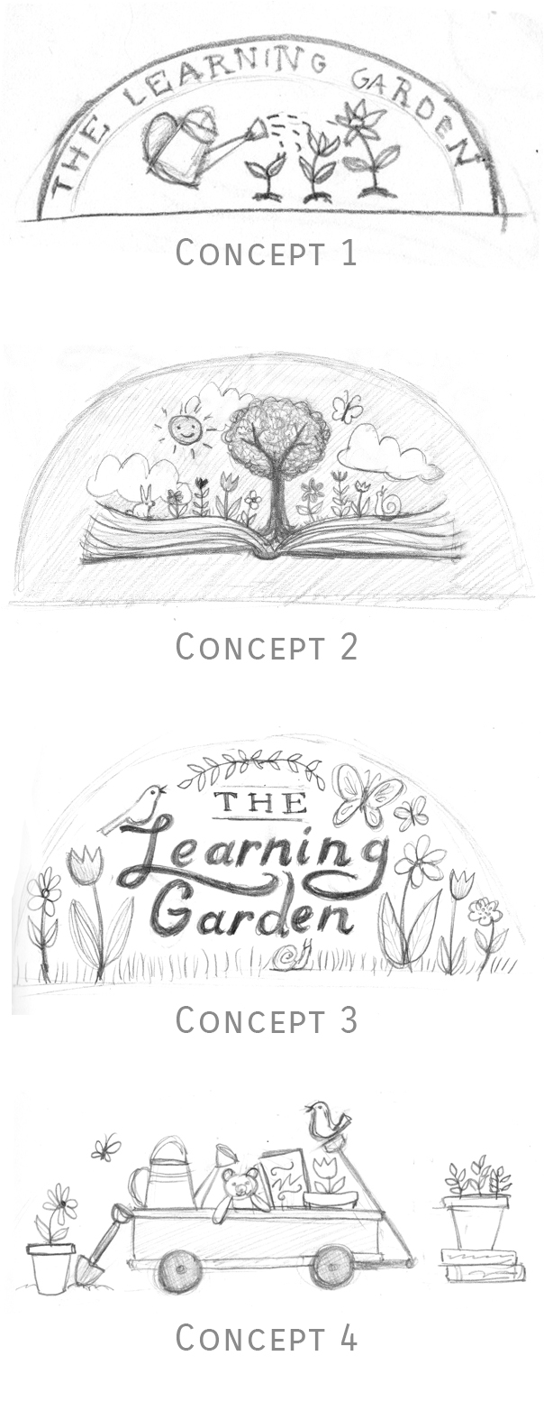
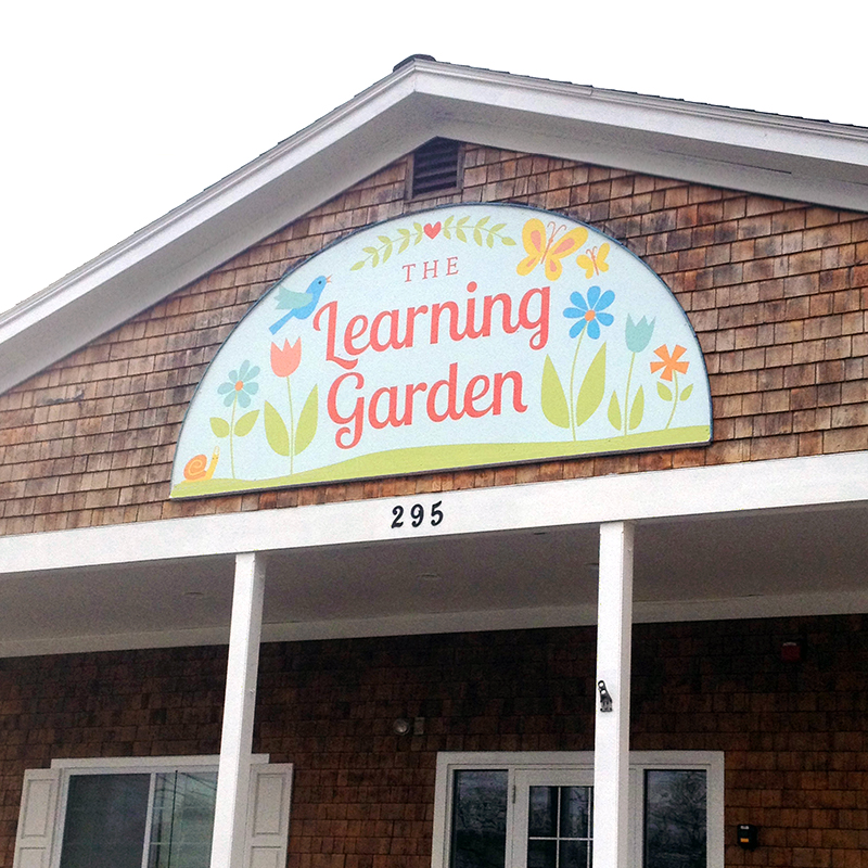
The Learning Garden logo
The Learning Garden is a home-like childcare center located in an old general store in a historic neighborhood of Warwick, RI. Children ages 6 weeks through 5 years grow and learn through play in a warm, nurturing environment. Featuring a large outdoor play area, The Learning Garden hopes to instill a love of nature in its students.
With these characteristics in mind, I created a logo that emphasizes learning, growth, and nature. Of the concepts I presented to Carla and Raquel, #3 was the winner. I'm so happy with how this illustrated logo turned out and wish The Learning Garden all the best!
“We knew how critical the logo for our daycare center would be in reflecting the look and feel of our brand to our customers but didn’t know where to begin. Working with Alli made us feel so much more confident. Alli made the process simple and designed an illustration that perfectly represented our center. She is professional, responsive, imaginative, easy to work with, and most importantly, has the market understanding to know how to translate our business’s brand into a logo that appeals to our customers.”
Self Stigma
Currently stitching...
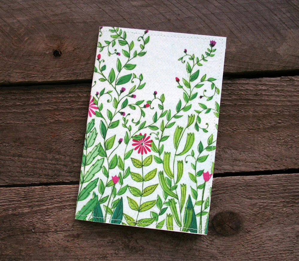
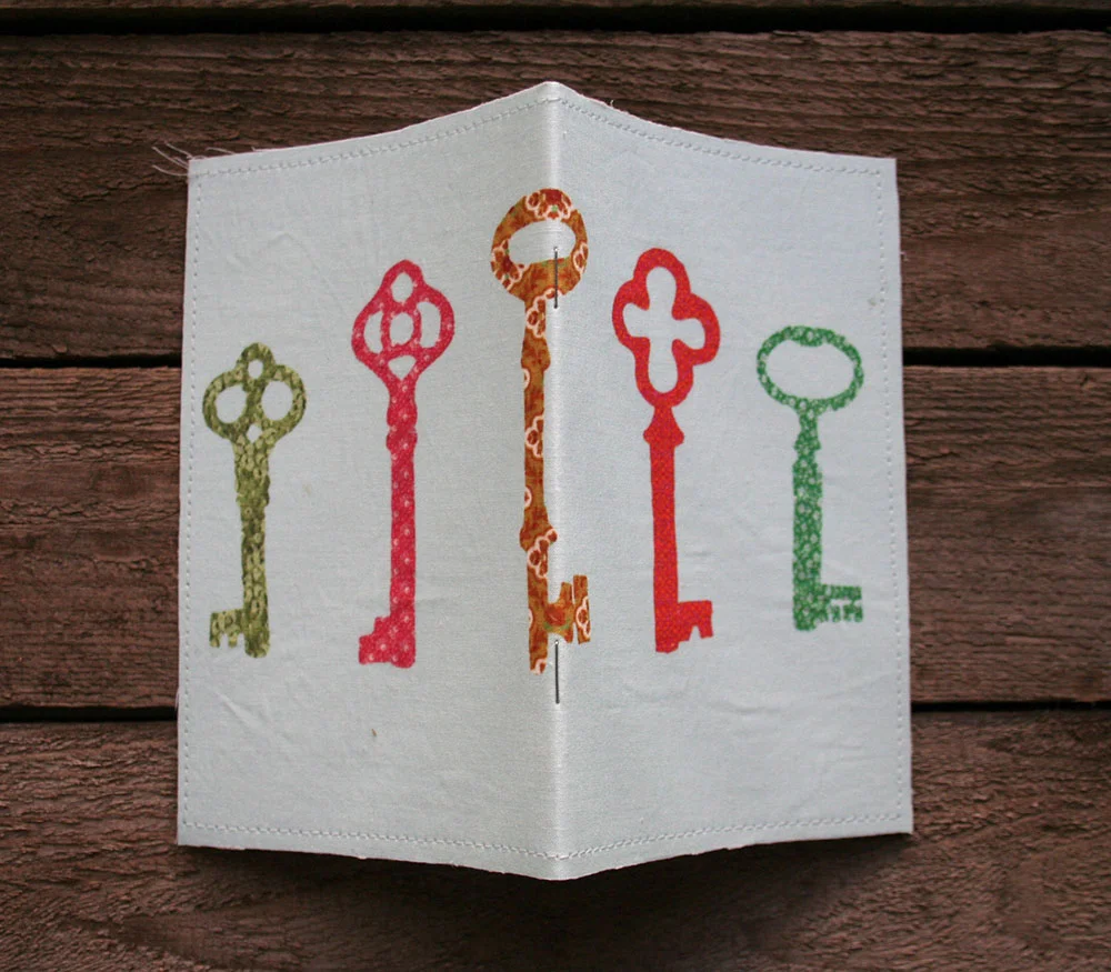
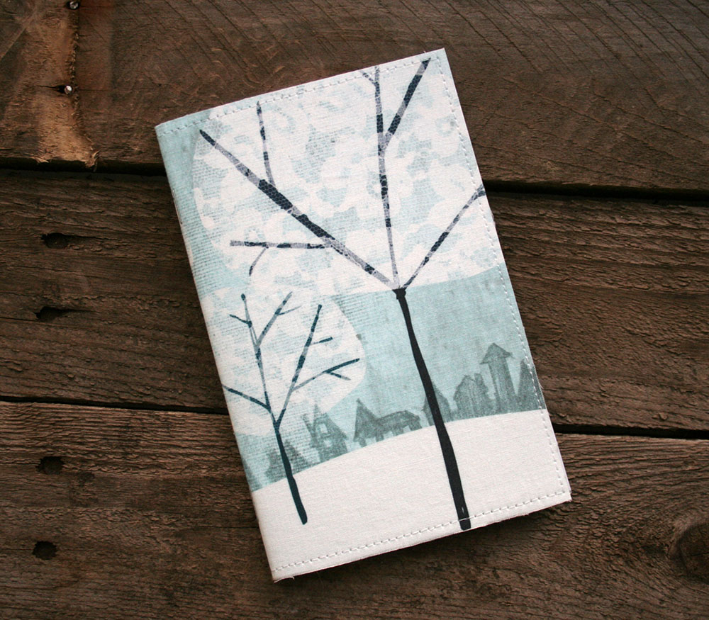
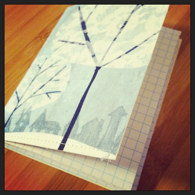
Trying out some new ideas today, like this little fabric covered sketchbook with stitched detail.
Painted Wooden Signs
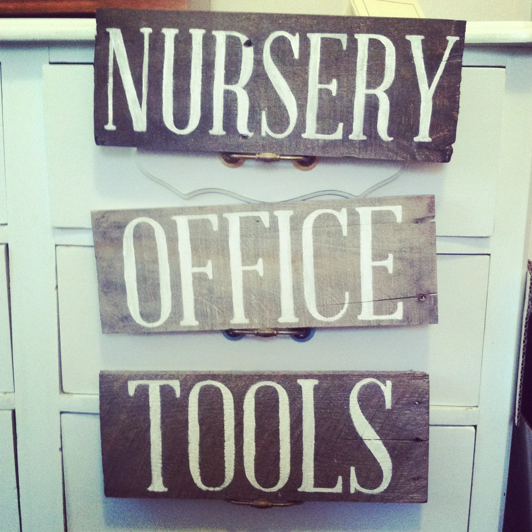
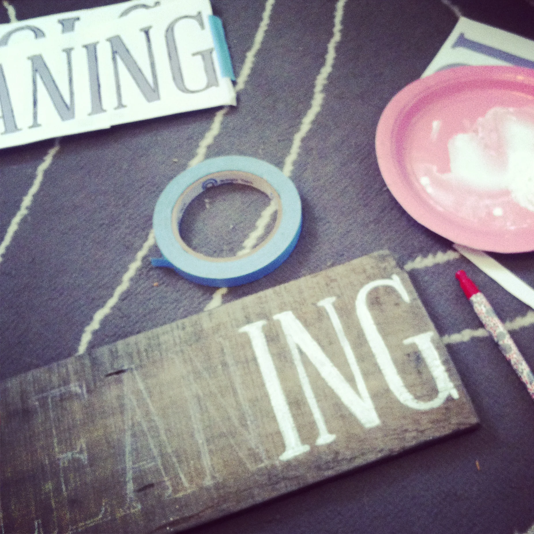
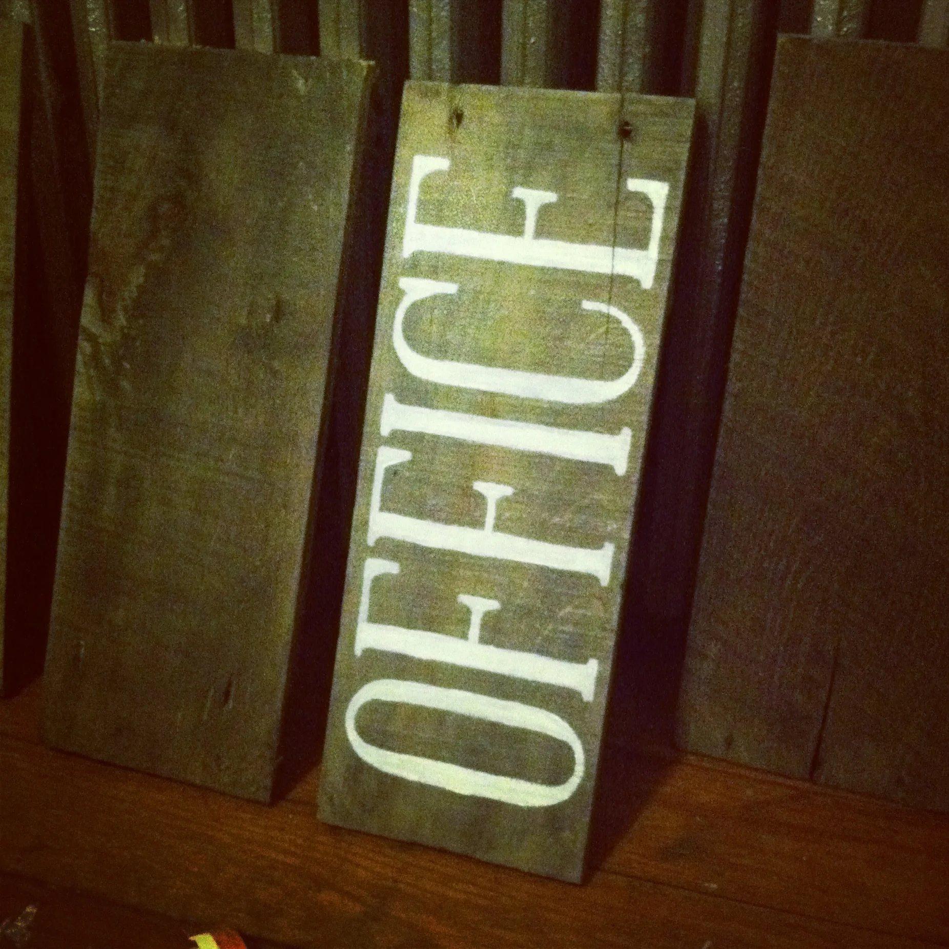
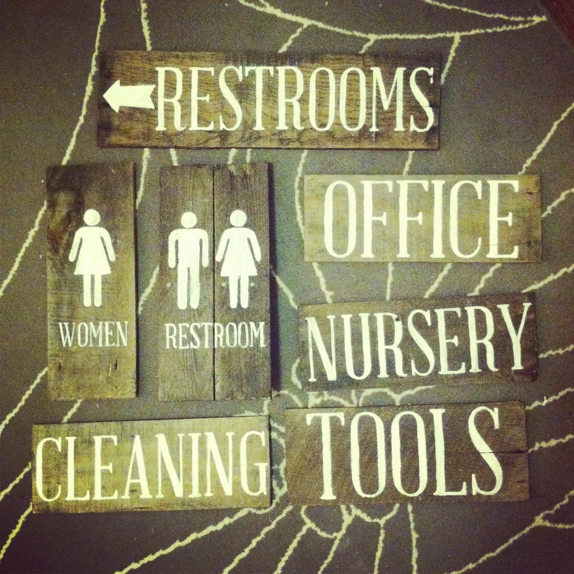
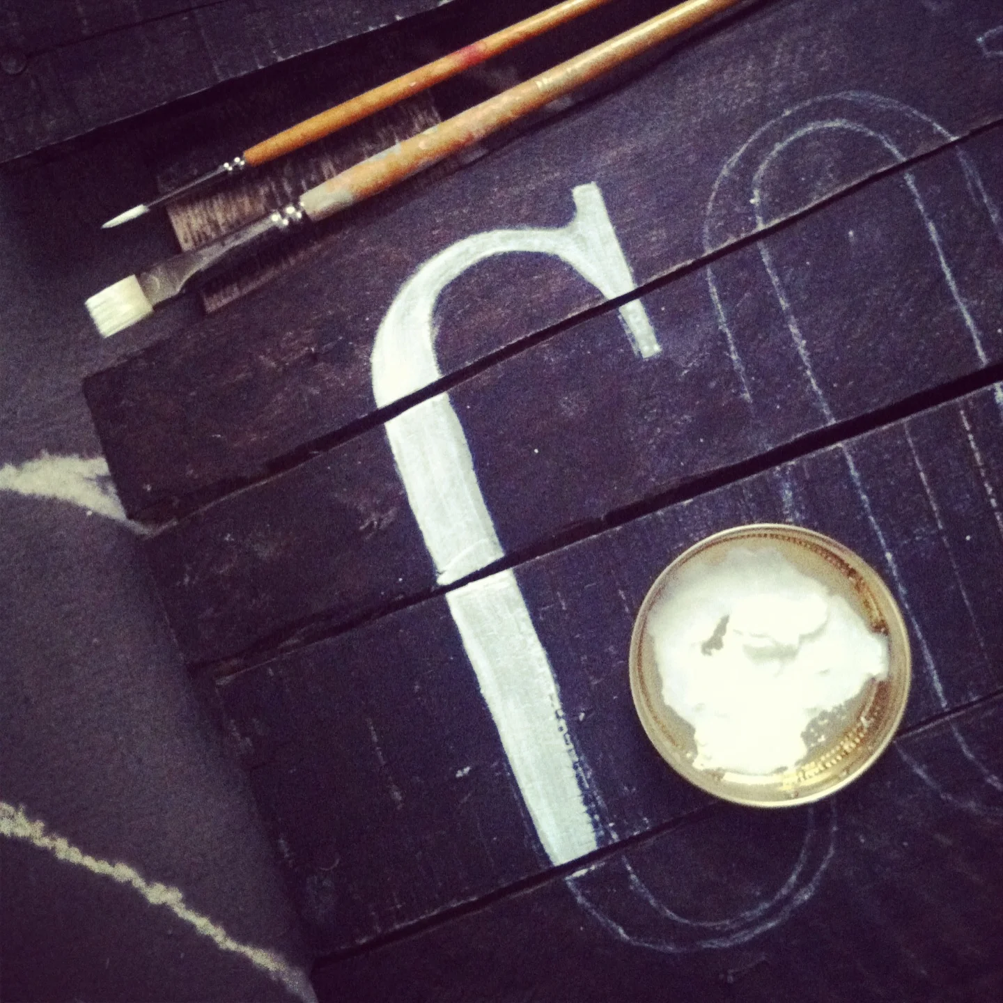
These hand-painted signs were created for Renaissance and are pretty simple to do yourself with only a few materials.
MATERIALS:
- wood, cut to size
- black wood stain (optional)
- print-outs of lettering or design
- white chalk
- paintbrush
- acrylic paint
Here's what I did:
- Since the wood pieces I used were from different sources and had slightly different colorings, I used a black wood stain to make all the pieces unified.
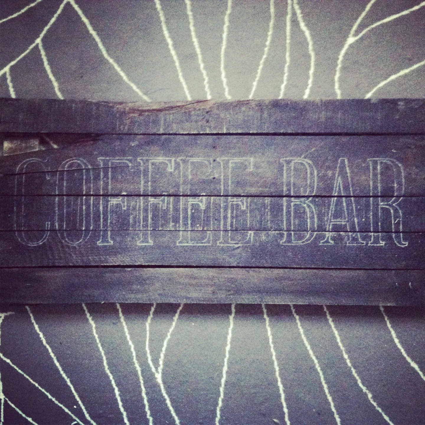
- I printed out the lettering to transfer to the wood by covering the back of the paper with white chalk. Then, I traced the paper printout letters with a ballpoint pen, pressing hard. This left a light chalk outline to help make the painting faster and easier.
- After the design was transferred, it was just a matter of painting all the letters in. I used a couple sizes of brushes and watered down my acrylic paint a tiny bit to help it flow better.
I love how these came out and would definitely recommend trying a similar project out yourself.
Work in progress
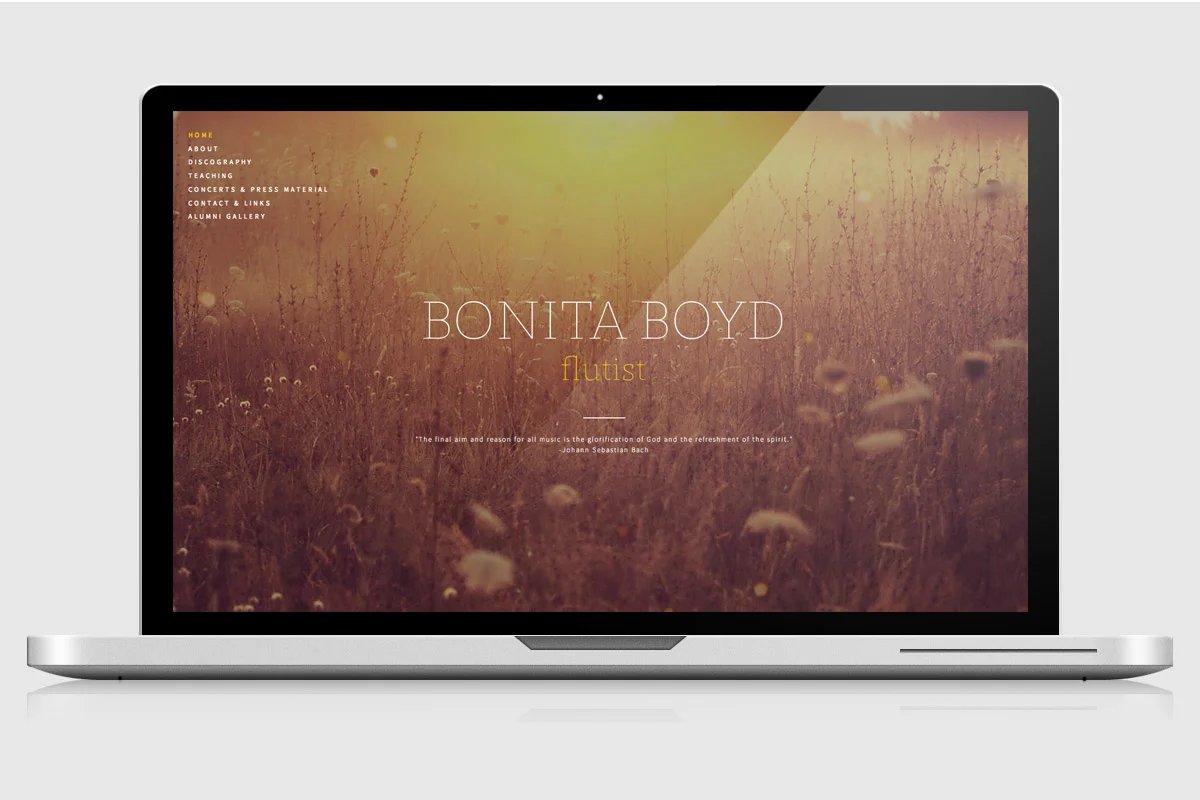
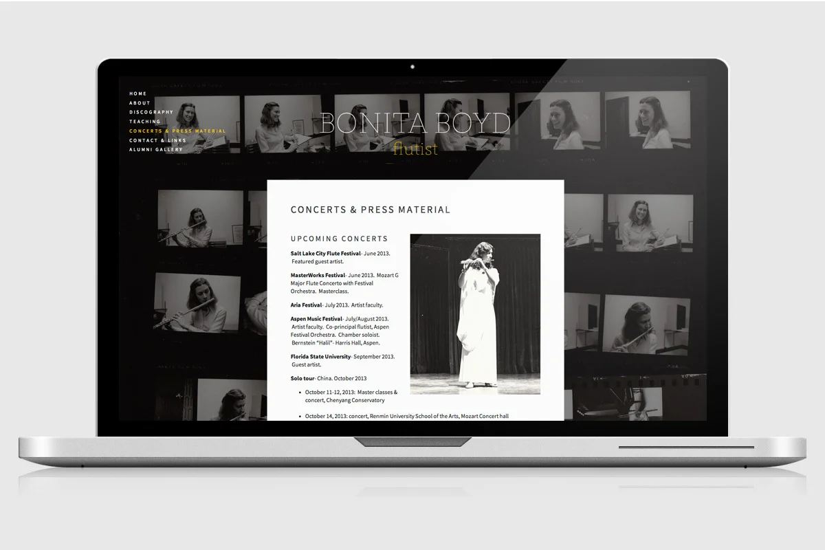
Bonita Boyd - website design
It was an honor to create this website for the extremely talented concert flutist Bonita Boyd. She performs all over the world, has recorded an impressive discography, and teaches at the Eastman School of Music. Bringing all of this together into one website really shows how passionate Bonita is, and how many lives she has touched! Congratulations on the new website, and all the best to you, Bonita!
CLIENT: Bonita Boyd
PROJECT: Website design, logo design, photo editing
RESOURCES: Powered by Squarespace. Fonts: St. Marie Thin, Source Sans Pro. Home page photo: courtesy of James Alby; all other photography provided by client.
“It is my great pleasure to recommend Alli Coate’s work in virtually every respect. She has designed a beautiful, sensitive, exciting, and imaginative website for me! Her design is absolutely marvelous- what she can do with the available materials to make them meaningful and striking is astonishing! Alli is also a delight to work with- organized, concerned and caring about her client’s needs and wishes, and a person of the utmost integrity. I am thrilled with her work!”
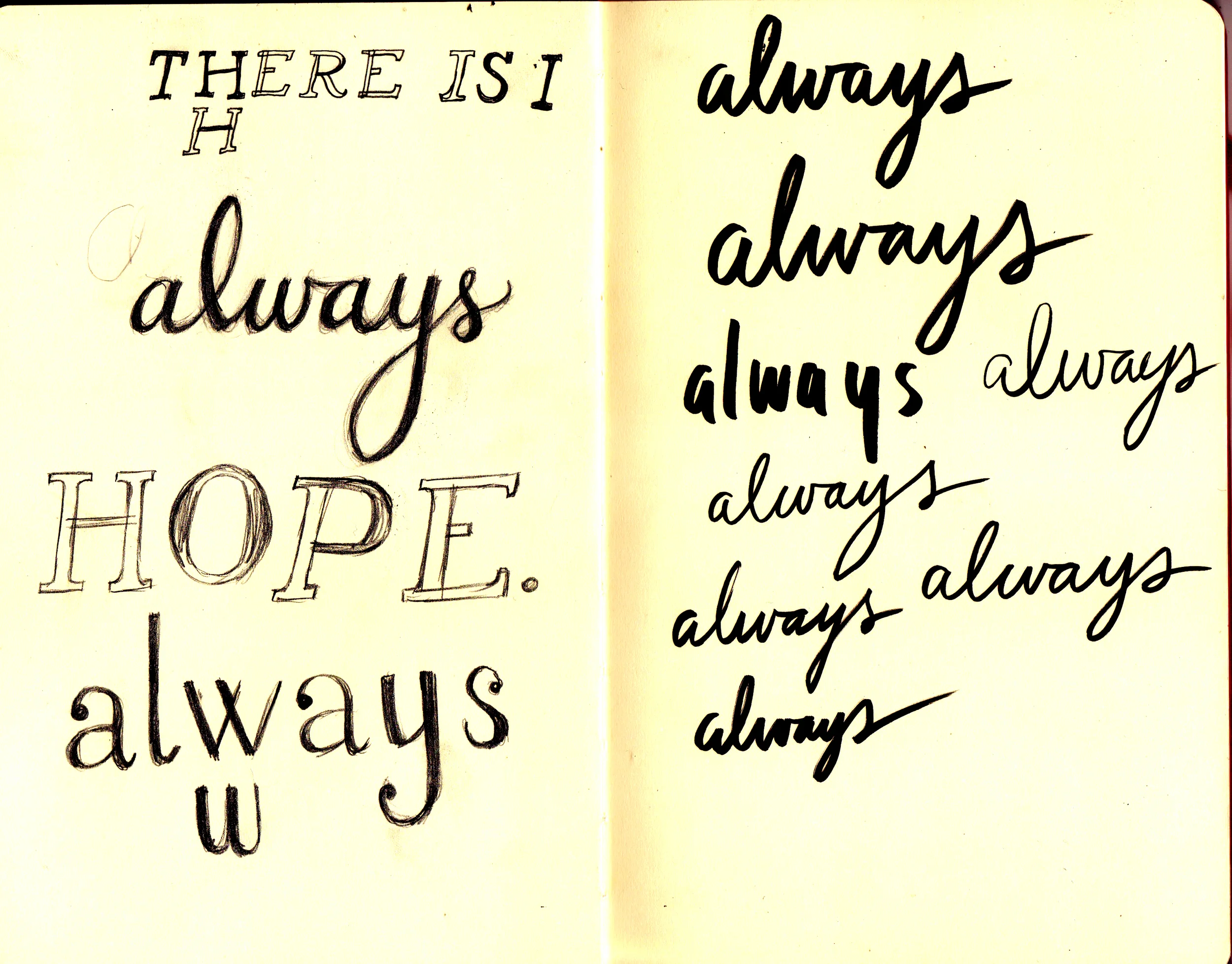
There Is Always Hope
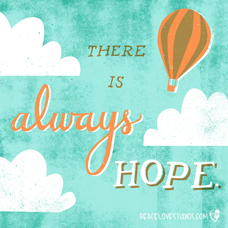
Remember that "there is always hope." Hand lettering and illustration for PeaceLove Studios, posted on their blog today. You can download this artwork as a free background wallpaper for your computer or phone from the PeaceLove blog.
Lettering work in my sketchbook
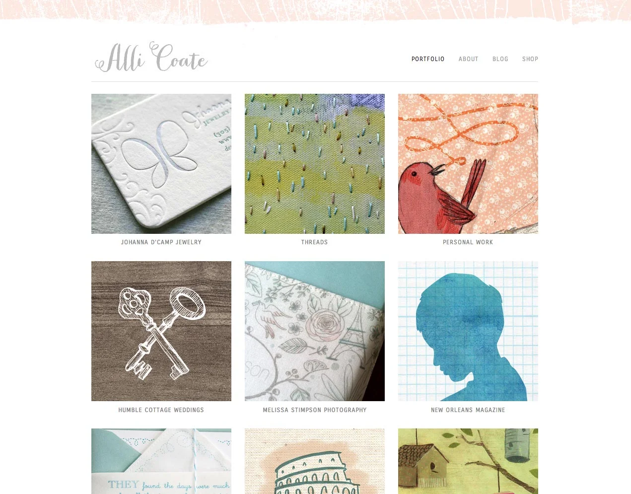
New Website
It's here! I've been making lots of websites for clients, then realized that it had been a very long time since I'd given any attention to my own. All I can say is - finally! And two thumbs up to Squarespace for being awesome.
Winter Lace Wedding Collection

Inspired by my Lace Trees print, this new collection from my wedding shop is a fresh take on a winter theme. Bits of lace, an icy shade of blue, and cardinal red accents are threaded through the collection, which includes pretty details like a Save the Date, table numbers, coordinating address labels, favor tags, menus and more.
As with my other wedding collections, the Winter Lace Collection was dreamed up for brides looking for a cost-effective way to handcraft a beautiful wedding, and need a little help getting started. My design files are delivered as PDF files that can be printed wherever and at whatever quantity you'd like.
Take a look at the whole collection here!

